Why enterprise teams should use system fonts in PowerPoint presentations
July 8, 2026 | 8 min read
This post is for marketing leaders and template owners who need PowerPoint decks to stay consistent across teams, devices, and clients without formatting breaking every time someone else opens the file.
There is a reason many large consulting firms, research firms, and advisory teams keep their PowerPoint templates built around system-safe fonts.
It is not because they lack taste. It is because their decks travel everywhere.
A consulting deck may move from an analyst to an engagement manager, then to a partner, then to a client leadership team, then to a boardroom. A research report deck may be edited by analysts, formatted by production teams, reviewed by senior leaders, and shared with clients across different regions.
In that kind of workflow, the deck cannot depend on one person having the “right” font installed.
The font needs to open correctly on different laptops, different operating systems, different offices, and different client environments. That is why system fonts are often preferred in high-output presentation environments. They reduce the risk of broken layouts, missing fonts, shifted text, and last-minute formatting surprises.
For consulting and research firms, this is not a small design decision. It is a production decision. When teams are creating client-ready decks every day, reliability matters as much as aesthetics.
And enterprise marketing teams face the same problem.
A regional marketing head is presenting a new campaign plan to the CMO. The deck was polished the night before. The title slide looked sharp. The charts were aligned. The typography felt modern and premium. Everyone had signed off on it.
Then the file opened on the meeting room laptop, and the font changed.
The headline wrapped into two lines. A key number moved out of its box. The chart labels looked heavier than expected. One slide suddenly felt cramped, another looked strangely empty, and the overall deck no longer felt like the same brand.
Nobody said, “This is a font issue.” They said what people usually say in enterprise meetings: “Why does this slide look different?”
That is the problem with using fancy fonts in enterprise presentations. They can look beautiful on one system, then quietly damage the deck the moment it is opened somewhere else.
For CMOs, this is not just a design problem. It is a brand consistency problem.
Why fonts become a brand problem
Enterprise decks move across teams, markets, devices, agencies, leaders, and clients. The more people touch them, the more fragile they become. And when a deck depends on a custom font that is not installed everywhere, PowerPoint does what PowerPoint does best: creates a problem nobody asked for.
This is why system fonts matter. Not because they are the most exciting design choice. Let’s not insult everyone involved. They matter because they are reliable. And in an enterprise environment, reliability is part of good design.
The hidden risk of fancy fonts
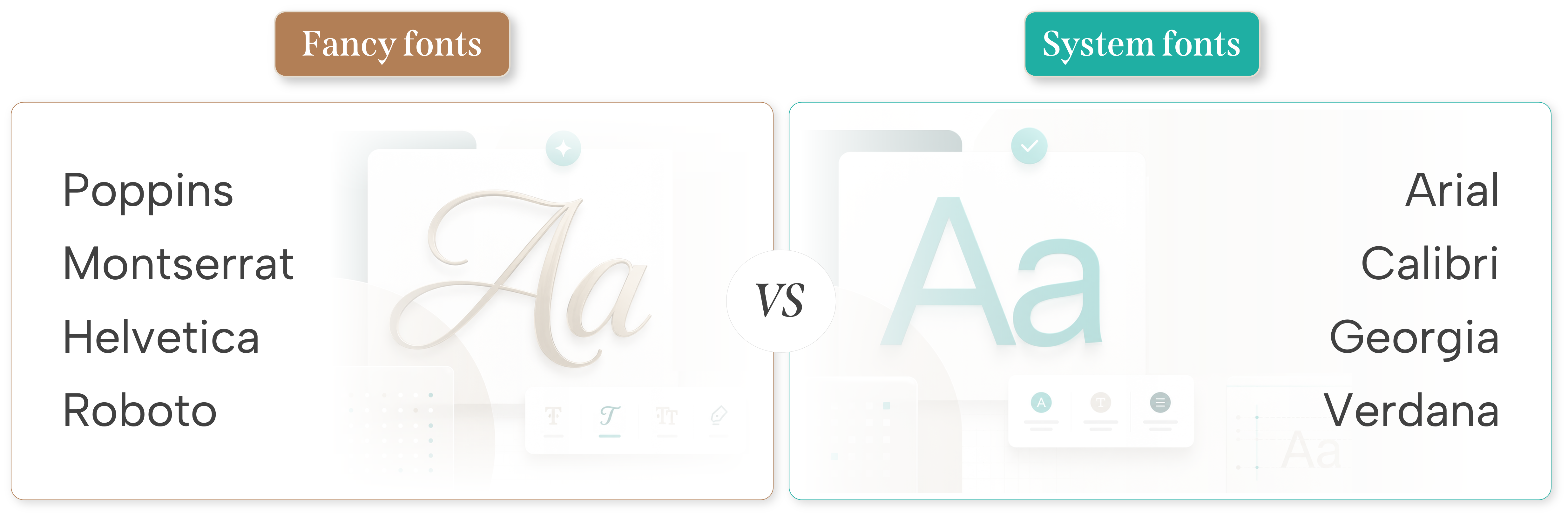
Fonts like Poppins, Montserrat, Helvetica, Roboto, and other custom typefaces can look great in controlled design environments. They feel modern, polished, and brand-friendly. But enterprise presentations are not controlled design environments.
They are opened on different laptops, shared across departments, edited by non-designers, sent to clients, reused by sales teams, and modified under deadline pressure.
If the custom font is not installed on someone’s device, PowerPoint replaces it with another font. That replacement can change the entire slide. Text may overflow. Line breaks may shift. Spacing may collapse. Charts may look unbalanced. Labels may no longer align. A slide that looked premium can suddenly look unfinished.
And the worst part is that most people will not understand why it happened. They will not blame the font. They will blame the deck.
Why CMOs should care
For a CMO, this matters because brand consistency does not only live on the website, in the campaign film, or inside the brand book. In many enterprises, PowerPoint is one of the most-used brand assets.
Sales teams use it. Marketing teams use it. Leadership teams use it. Regional teams use it. Partner teams use it. Client-facing teams use it.
That means the PowerPoint template is not just a design file. It is a daily business tool. It is where the brand gets copied, edited, stretched, localized, and sometimes damaged by someone trying to “just make one quick change.” A tiny phrase that has ruined more slides than most design trends ever could.
When the presentation system is fragile, the brand experience becomes fragile too. A custom font may look beautiful in the brand guidelines, but if it does not work across the organization, it creates friction.
It slows teams down. It creates formatting errors. It increases dependency on designers. It makes decks harder to edit. It causes version control issues. It forces people to waste time fixing slides instead of preparing the actual message.
For enterprise marketing teams, that is not a small design inconvenience. It is an operational problem.
Why system fonts work better for enterprise teams
System fonts solve a big part of this problem because they are already available on most computers. Fonts like Arial, Calibri, Georgia, Verdana, Aptos, Segoe UI, and Times New Roman may not sound exciting, but they are reliable.
And when a deck needs to be used across hundreds or thousands of employees, reliability is not boring. It is useful, which is apparently still underrated.
System fonts help presentations stay consistent across devices. They reduce the risk of broken layouts. They make templates easier for teams to edit. They also reduce unnecessary back-and-forth between marketing, sales, leadership, agencies, and design teams.
A good enterprise template should not need special instructions every time someone opens it. It should not depend on one designer’s laptop. It should not collapse because one regional team does not have the right font installed. It should simply work.
Custom fonts are not always wrong
This does not mean custom fonts should never be used. They absolutely have a place.
Custom fonts can work well for websites, campaign visuals, social media creatives, brand films, event graphics, PDFs, and high-control design assets. They can also work in presentations when the file will only be used by a controlled group of people who have the font installed.
But editable enterprise PowerPoint decks are different. A presentation template is a working tool. People will use it, edit it, duplicate it, localize it, repurpose it, and send it to someone else. That means the font choice has to support usage, not just aesthetics.
A font that looks beautiful but breaks the deck is not a good font choice for PowerPoint. It is a decorative liability wearing nice shoes.
If you really want to use fancy fonts, embed them
There is a way to use custom fonts more safely in PowerPoint: you can embed the fonts inside the deck.
When fonts are embedded, the presentation carries the font file with it. This helps the deck look more consistent even when it is opened on another device where the font is not installed.
That sounds perfect, until PowerPoint politely reminds everyone that convenience has a price.
Embedding fonts can increase the file size of the deck. Sometimes, significantly. This can make the presentation heavier to share over email, slower to open, and harder to manage when the deck already has images, charts, videos, or multiple layouts.
There can also be font licensing limitations. Not every custom font allows embedding. Some fonts may only allow viewing, while others may allow editing. So before using this approach across an enterprise template, teams need to check whether the font can legally and technically be embedded.
This approach is useful when the brand font is important and the deck must remain editable. But it should be used carefully. For large enterprise teams, system fonts are still the simpler and more scalable choice.
When system fonts are the safer choice
System fonts are usually the better choice when the deck will be edited by multiple teams, shared externally, used across regions, opened on both Windows and Mac, handled by non-designers, or used in sales, leadership, investor, or board communication.
In all these situations, reliability matters more than typographic personality.
And honestly, most enterprise decks do not need more personality from the font. They need clearer messaging, better structure, cleaner charts, and fewer slides trying to say twelve things at once. The font is not where the drama should be.
The question CMOs should ask before approving a template
Before approving a new enterprise PowerPoint template, CMOs should ask one simple question:
Will this deck still look correct when someone else opens and edits it?
If the answer is uncertain, the template is not enterprise-ready.
A strong enterprise deck should pass the real-world test. Sales should be able to use it without breaking it. Regional teams should be able to adapt it without losing the brand. Leadership should be able to open it on another laptop before a meeting. External partners should be able to view it without missing fonts. Teams should be able to edit it quickly without calling the design team for every small change.
If the template cannot handle these situations, it may look good in a brand review, but it will fail in daily use. And daily use is where the brand actually lives.
The smarter approach
The smarter approach is not to remove design from presentations. It is to design for the way presentations are actually used.
Use system fonts for editable PowerPoint templates. Build visual hierarchy through size, weight, spacing, layout, color, and structure. Create clear master slides. Keep typography simple and consistent. Use custom fonts only in controlled assets, final PDF outputs, or carefully managed decks where font embedding has been tested.
This gives enterprise teams the best of both worlds: a deck that looks professional and a deck that remains usable.
Because the real goal is not to make one slide look impressive on one screen. The goal is to make every slide stay consistent wherever the deck travels.
The conclusion: Fancy fonts can make a slide look good. System fonts help a deck stay good.
For enterprise teams, that difference matters. A presentation is not just a design file. It is a business communication tool. It moves through sales conversations, leadership meetings, investor discussions, boardrooms, and client pitches.
If the font breaks, the deck breaks. And when the deck breaks, the brand takes the hit.
So the next time your team builds a PowerPoint template, do not start with the most beautiful font. Start with the font that will survive the enterprise.
That may sound less glamorous, but in a large organization, consistency is the real luxury.
Questions we hear often

We use storytelling and design to build high impact presentations for leading brands
PowerPoint design
services and outsourcing
Enterprises, analysts, consultants
Investor pitches
and fundraising narrative
Founders, fund managers
Sales presentations, proposals, and collaterals
Sales & marketing teams
PowerPoint template and visual slide bank
Enterprises, advisory & research firms
CXO presentations
and thought leadership
IT-BPO services & consulting firms
Financial, ESG,
and annual reports
Financial services, large enterprises
Training – PowerPoint design and visualization
Sales team, analysts, consultants
Conference and event presentations
Keynote speakers, event managers