How to transform table slides in PowerPoint into visually engaging presentations
May 19, 2025 | 5 min read
For consultants and analysts… Tables in PowerPoint are like instant noodles – easy to make, and there’s nothing inherently wrong with them.
However, in today’s world – where attention spans are shrinking and content is consumed faster than ever, old-school tables just don’t cut it.
They add to the cognitive load, forcing the audience to read, scan, and interpret more than they should.
I’ve seen it firsthand – having worked in consulting firms, I know that in a typical 25-slide document, there are easily 4–5 table slides.
And trust me – unless you spend time reading every word, they all start to look the same.
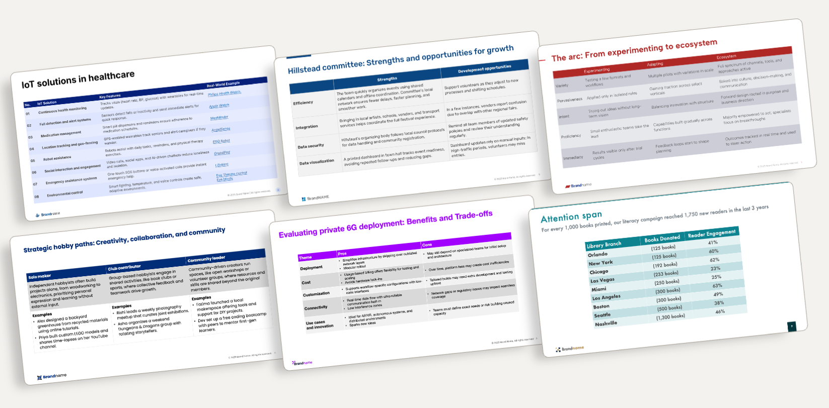
Same table, different logo
Take a look at the slides below. Different companies. Different brands. Different data.
And yet… the tables look almost identical.
Why? Because they’re all built using the same default PowerPoint structure.
What a better table slide can do
A thoughtfully reimagined table doesn’t just look better – it works better.
-
It clarifies complex information
-
It directs attention to what matters
-
It makes your insights easy to understand
This article explores a series of before-and-after slide transformations that show how strategic table redesign can elevate dry data into compelling visual stories – without losing the detail consultants and analysts care about.
1. From data-dump to clarity at a glance
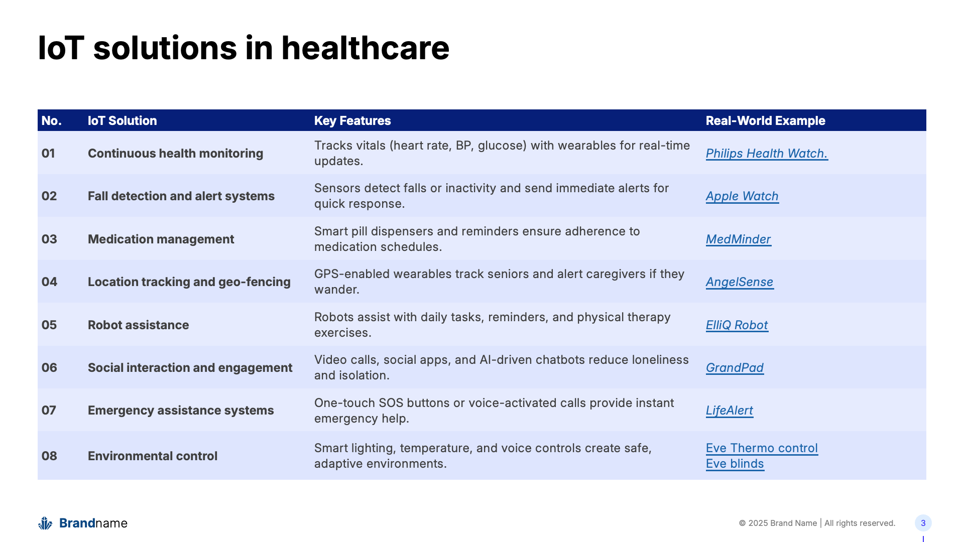
Table slides are great for packing in information, but they can easily overwhelm your audience. On the left, we had a dense, text-heavy table listing IoT healthcare solutions. Informative? Yes. Easy to absorb quickly? Not quite.
We transformed it by turning key points into visual blocks, each solution now lives in its own space, with icons and product visuals that guide the eye and aid recall. The result? A slide that not only informs but engages.
✓ Cleaner layout
✓ Instant visual cues
✓ Better retention of key messages

2. Turning pros and cons into a visual conversation
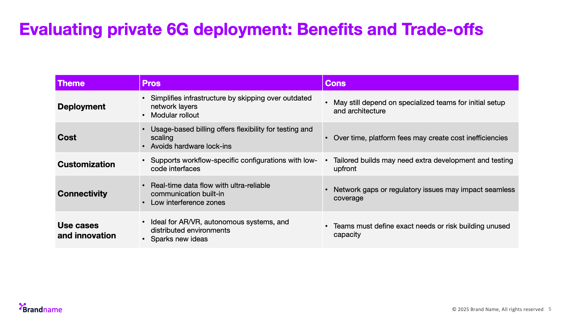
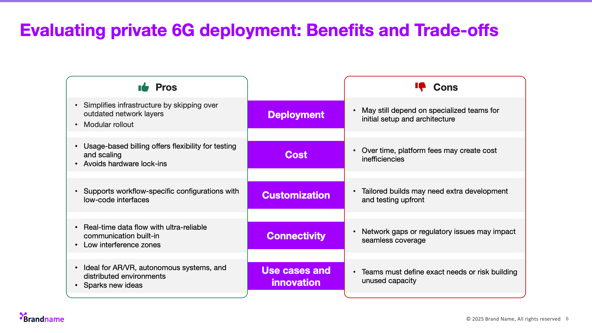
The original table (left) does its job, listing out the benefits and trade-offs of 6G deployment, but it feels flat and monotonous. You have to read line-by-line to make sense of the comparisons.
On the right, we restructured the slide to separate the pros and cons visually, with intuitive icons, bold section labels, and a clearer flow. It helps your audience scan faster, grasp structure instantly, and retain more.
✓ Improved comparison through side-by-side layout
✓ Clearer visual hierarchy
✓ Stronger engagement with iconography
3. Making progression feel intuitive
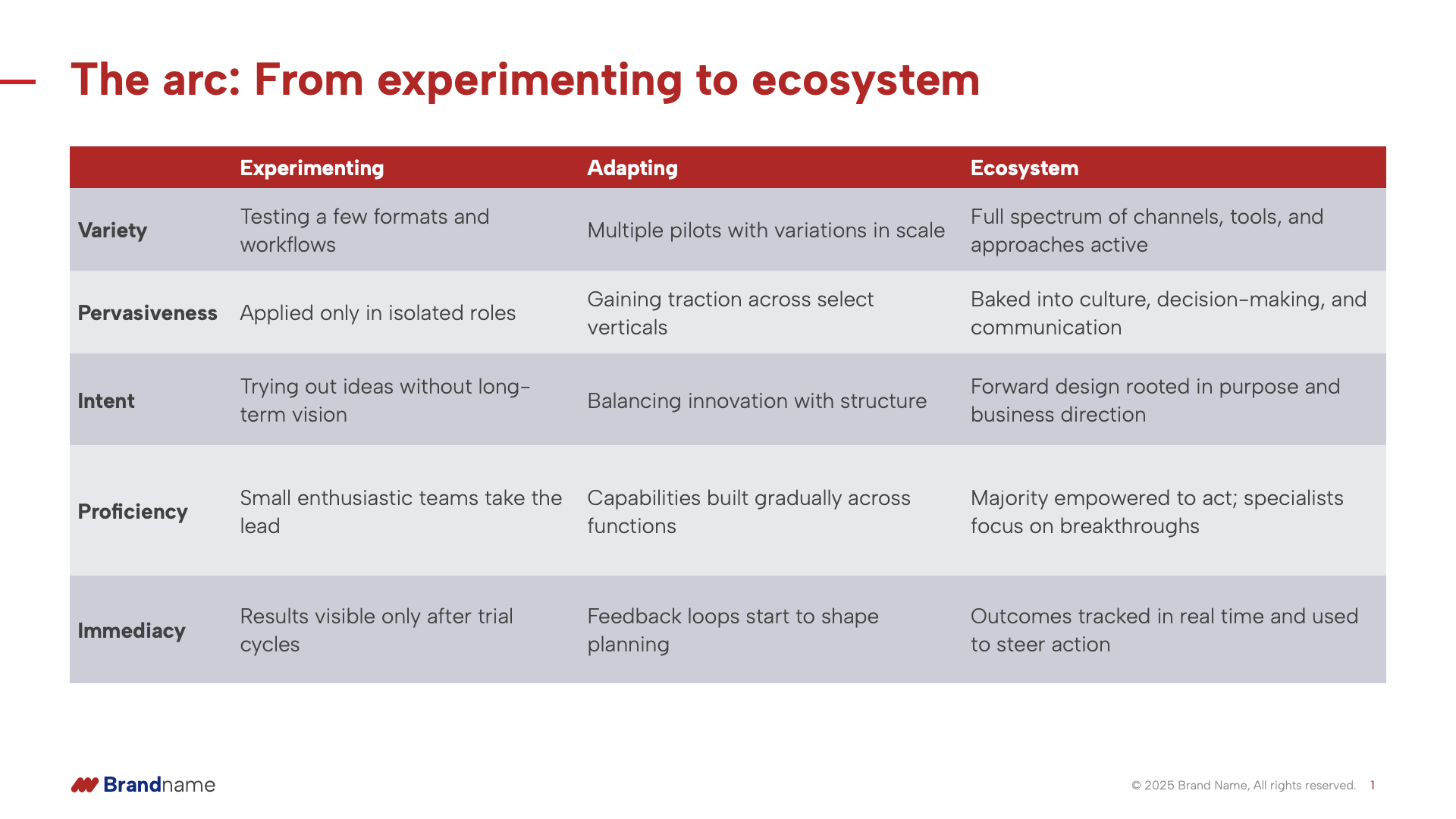
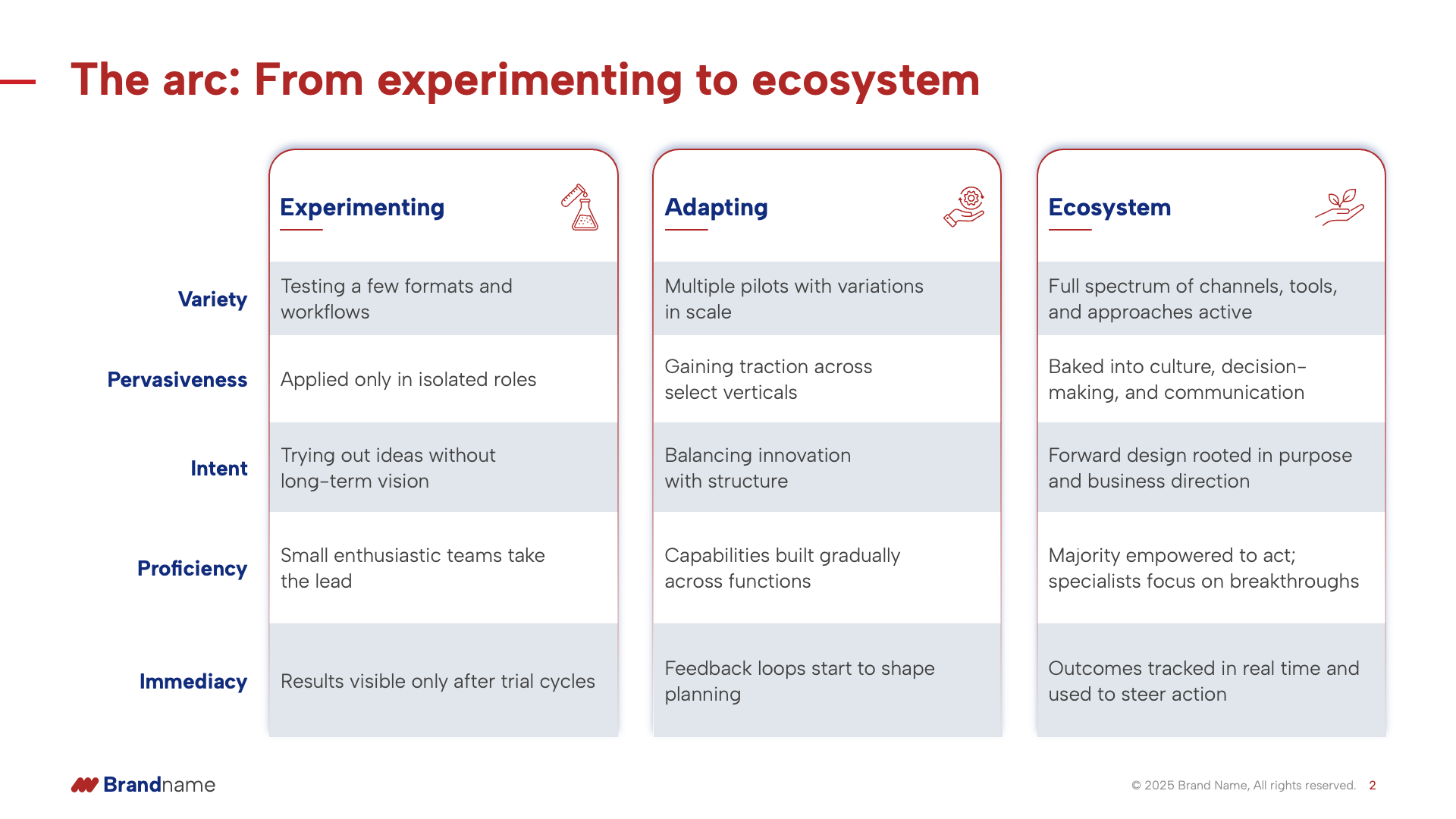
The original version (left) outlines the transition from experimenting to ecosystem, but the horizontal layout makes it hard to follow the flow. It feels more like a static table than a dynamic journey.
On the right, we redesigned it to feel more like a narrative. Each stage is visually separated with icons and vertical flow, guiding the viewer naturally from one phase to the next. This brings clarity to the evolution and reinforces the message of maturity.
✓ Clearer progression across stages
✓ Vertical flow enhances readability
✓ Icons add context and visual memory
4. From plain table to polished clarity
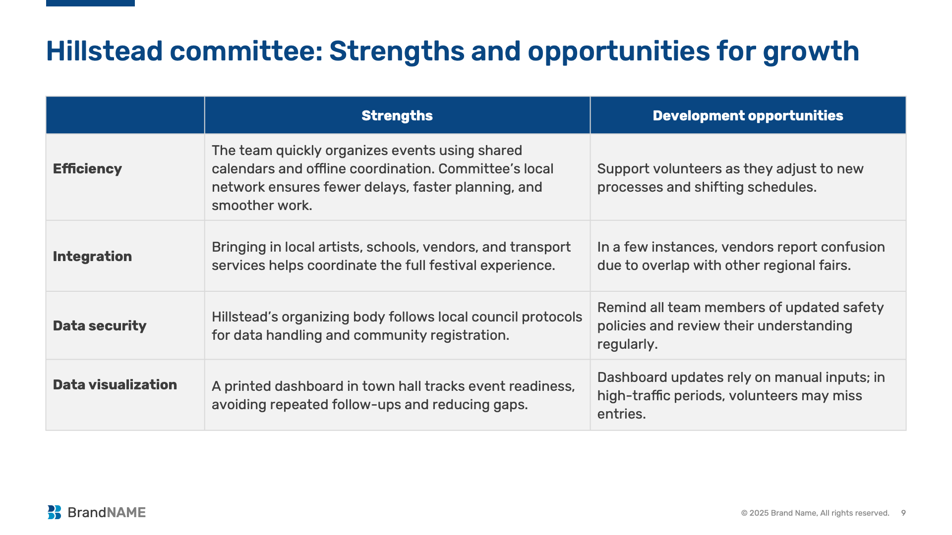
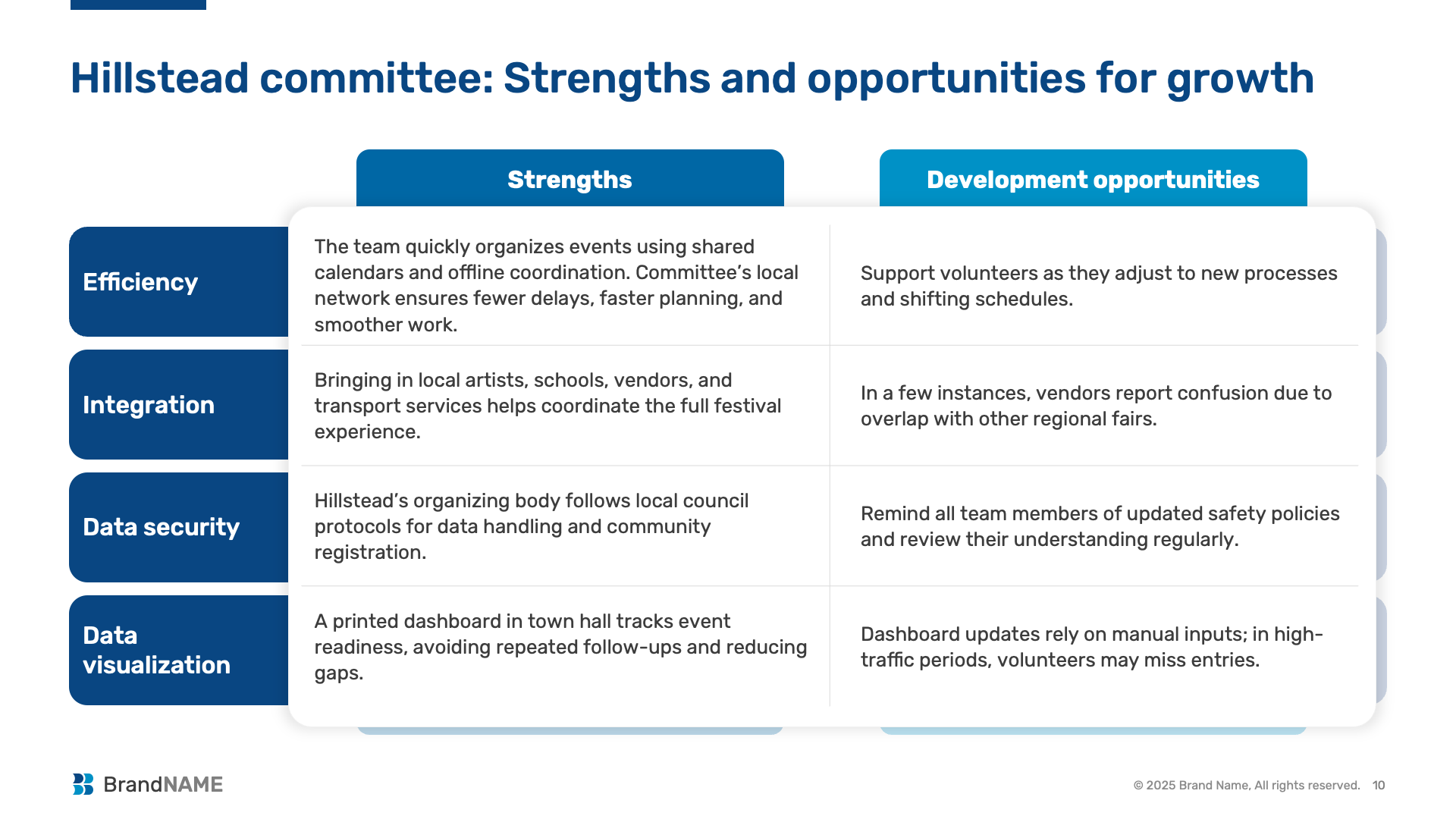
The original slide (left) captures useful content, strengths and development opportunities, but the layout feels flat and text-heavy. Everything carries equal weight, making it harder for key themes to stand out.
On the right, we redesigned the table with clear headers, better spacing, and visual contrast. Rounded shapes and color-coded sections make the content easier to follow and scan—helping your audience grasp both praise and potential in one glance.
✓ Improved visual grouping
✓ Enhanced readability with spacing and alignment
✓ Friendlier design without losing depth
5. Bringing data to life with visual cues
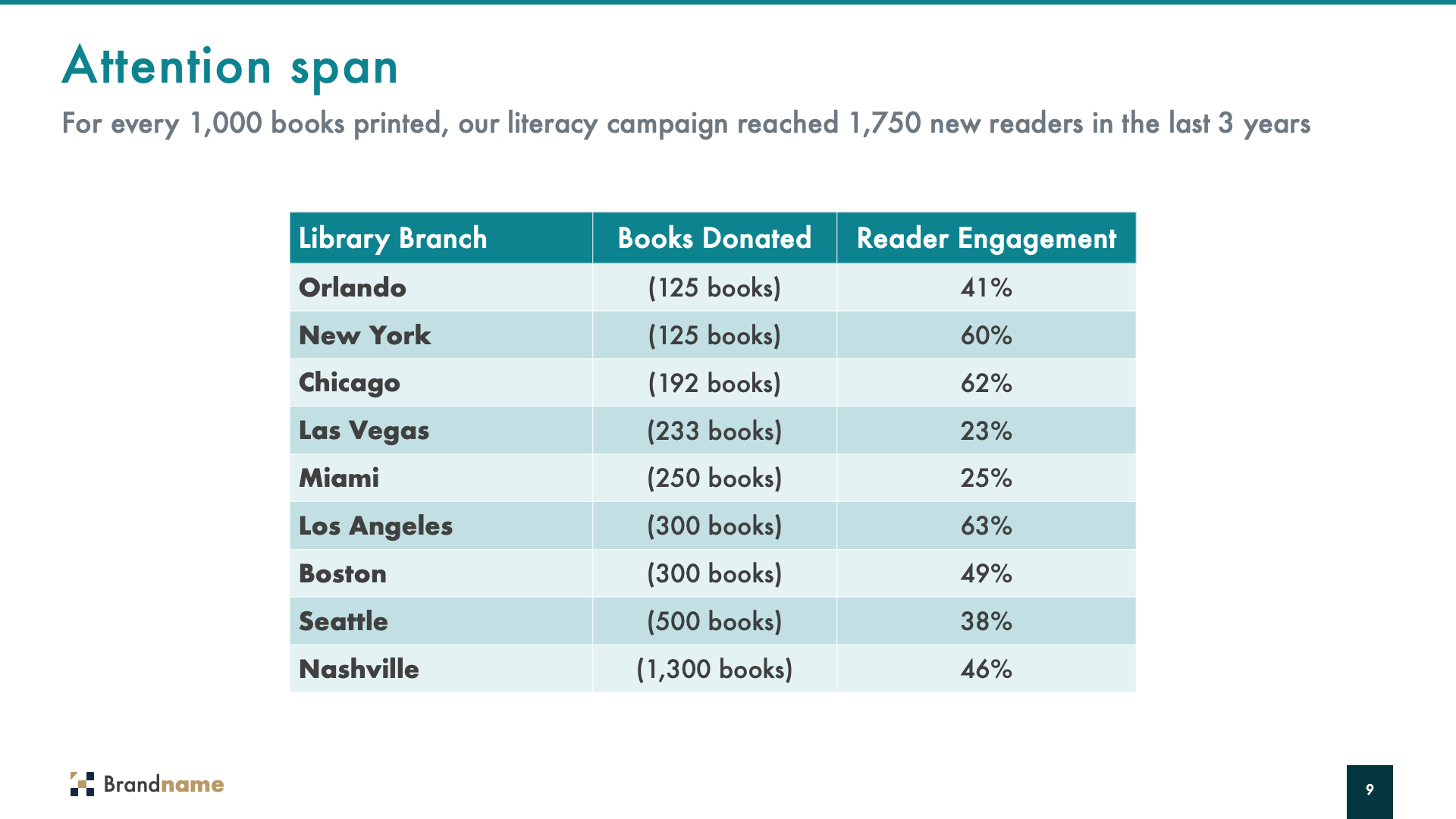
The original slide (left) presents important data on books donated and reader engagement, but the flat table makes it hard to quickly compare cities or spot trends.
In the redesigned slide (right), we swapped the table for clean visual blocks with built-in color coding. Reader engagement is now instantly scannable thanks to a traffic light-style gradient, and each city stands out on its own.
✓ Easy visual comparisons
✓ Clearer data-story through color
✓ Engaging and reader-friendly layout

6. Bringing personality into structured slides
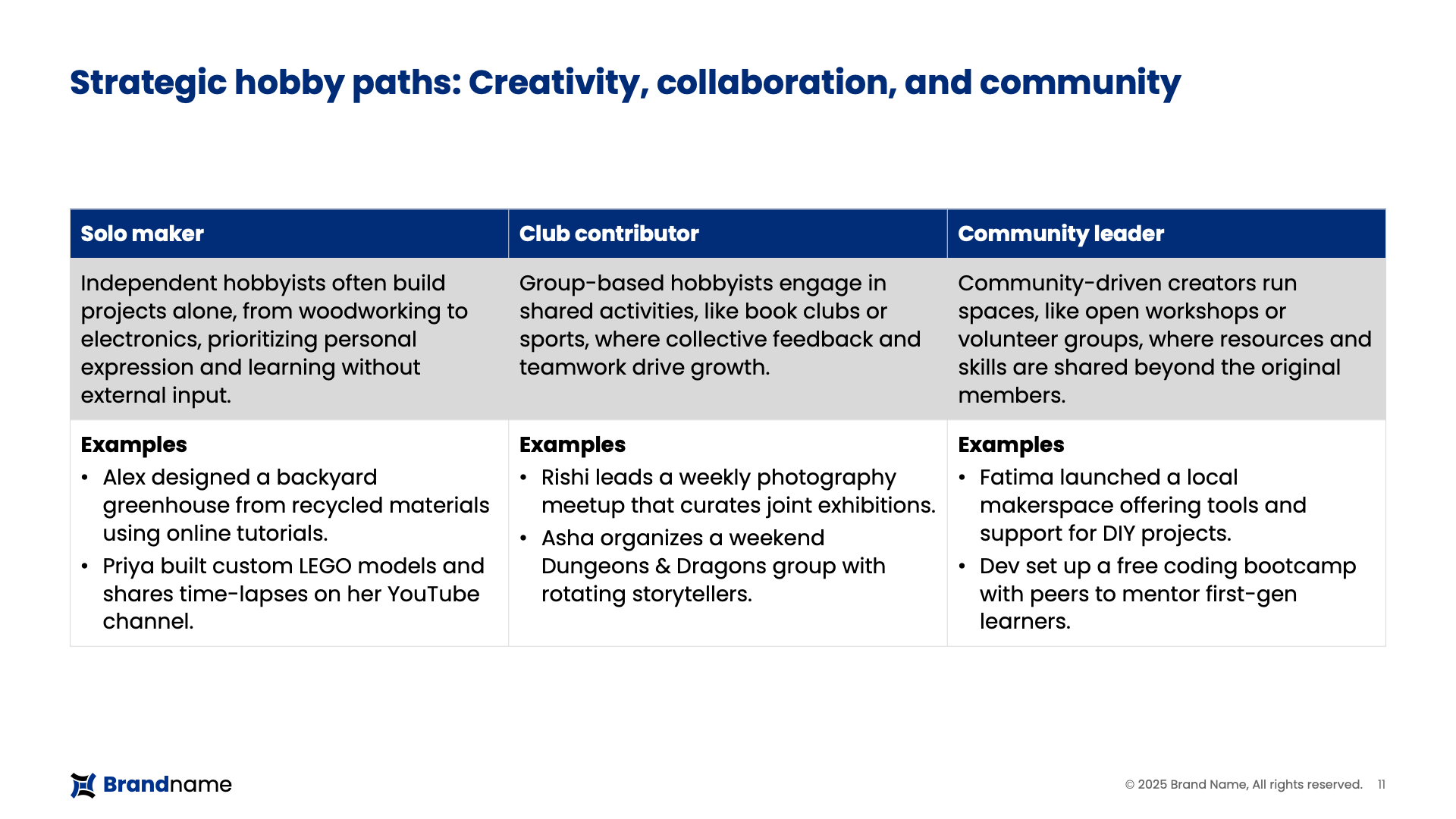
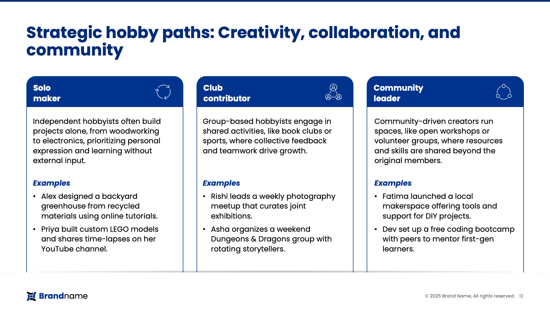
The original table (left) clearly explains the three strategic hobby paths, but the format feels static and academic. Each role is boxed into a grid, with no visual distinction or narrative pull.
In the redesigned version (right), each hobbyist type is broken into individual cards with icons and cleaner hierarchy. This not only improves readability but also gives each path a distinct identity, making it easier to connect with the content.
✓ Stronger visual segmentation
✓ Icons and cards enhance readability
✓ Examples feel more relatable and dynamic
The conclusion: Design that makes data speak
Tables are incredibly useful for organizing information, but they’re not always the best choice for visual representation.
As these redesigns illustrate, a table-to-slide transformation unlocks:
- Better audience engagement
- Clearer, more memorable messaging
- Faster comprehension
No matter the topic, healthcare, tech, finance, or community insights, visual slides elevate your story and respect your audience’s time.
Do not just present data. Make it resonate.
You may also like
We use storytelling and design to build high impact presentations for leading brands
PowerPoint design
services and outsourcing
Enterprises, analysts, consultants
Investor pitches
and fundraising narrative
Founders, fund managers
Sales presentations, proposals, and collaterals
Sales & marketing teams
PowerPoint template and visual slide bank
Enterprises, advisory & research firms
CXO presentations
and thought leadership
IT-BPO services & consulting firms
Financial, ESG,
and annual reports
Financial services, large enterprises
Training – PowerPoint design and visualization
Sales team, analysts, consultants
Conference and event presentations
Keynote speakers, event managers


