Five common consulting presentation mistakes and how to fix them for better results
December 4, 2024 | 3 min read

As consultants, we’ve all been there. You spend hours crafting a presentation filled with insights, but when it’s time to deliver, something feels off. The message doesn’t land the way you envisioned, and the impact falls short.
It’s frustrating, isn’t it? Especially when you know your ideas have the power to drive real change. But here’s the catch, how you present your ideas is just as important as the ideas themselves.
Presentation design is not just about making your slides look good; it’s the art of turning complex ideas into clear, compelling stories that resonate with your audience. Here are five common design pitfalls in consulting presentations, and practical ways to avoid them
1.
Text overload: When your slides look like a wall of words
Ever come across a slide so packed with text it feels like you’re reading a novel? When slides are overloaded with long paragraphs or endless bullet points, your audience tunes out. It’s overwhelming and distracts from your message.
How to fix it:
- Stick to “one message per slide” to keep things focused and digestible.
- Use clear headlines and visuals to break up content and emphasize key takeaways.
- Save the finer details for your verbal delivery. Slides should support your talk, not replicate it.
Pro Tip: Test your slide by glancing at it for five seconds. If you can’t immediately identify the key message, your audience won’t either.
2.
Lack of structure or visual hierarchy
If your audience doesn’t know where to look first or what to take away from your slide, its purpose is lost. Slides without a clear structure leave people guessing, which leads to confusion and disengagement.
How to fix it:
- Organize your content with headers, subheaders, and body text to create a natural flow.
- Highlight key points using bold fonts, larger text, or a touch of color to draw attention.
- Guide the audience’s eyes with a clear layout, like the Z-pattern or F-pattern, which people naturally follow when reading.
Your slide should feel like a map, where the most important point stands out immediately. If your audience has to search for it, they’re already losing interest.
Want to dive deeper into presentation design principles? Check out our blog: Three key principles behind making impressive consulting style-presentations .
3.
Turning data into insights, not confusion
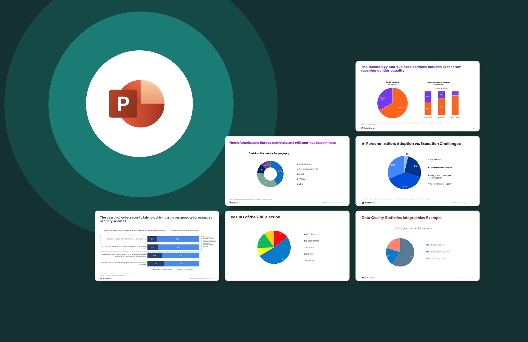
We all appreciate a good graph, but let’s face it, sometimes they go overboard. Overcomplicated charts with too many data sets or details can confuse your audience instead of enlightening them. Remember, your audience isn’t here to solve a data puzzle.
Here’s what works:
- Choose the right chart type: Use bar charts for comparisons, line charts for trends, and pie charts sparingly, for simple proportions only.
- Simplify your visuals: Limit data points, use clean labels, and eliminate clutter like unnecessary gridlines.
- Make details clear: Include a concise chart title, unit of measure, citation, and sample size so nothing is left to guesswork.
- Add a key takeaway: A simple statement like “Revenue increased 25% this year” gives your audience immediate clarity on what matters.
The goal is simple: Your data should tell a story at a glance. If your audience has to decode it, you’ve already lost them.
4.
Inconsistent branding and formatting
Nothing screams “rushed job” like a deck with mismatched fonts, inconsistent colors, misaligned objects, or slides that feel like they were stitched together from different presentations. It’s distracting, unprofessional, and can undermine your credibility.
Here’s how to keep it clean:
- Stick to your brand guidelines for fonts, colors, and logos to maintain a cohesive look.
- Use slide masters or templates to ensure uniformity across all slides.
- Focus on details like alignment, spacing, and consistent font sizes, especially for the slide body.
Polished slides reflect professionalism and attention to detail. When your visuals are consistent, your audience is more likely to trust your message.
5.
Neglecting white space
A common mistake is thinking every inch of the slide needs to be filled with content. The result? Overcrowded slides with no breathing room, leaving your audience overwhelmed and unsure where to focus.
Why white space matters:
- Improves readability: It separates sections and makes your slides easier to scan.
- Creates balance: A clean layout is more visually appealing and professional.
- Prioritizes content: White space forces you to focus on what truly matters instead of cramming in every detail.
Pro tip: Follow the 80/20 rule, keep 80% of your slide clean and simple, while the remaining 20% carries your core message. Think of white space as a design tool that guides attention and enhances impact.
The conclusion
Designing a great consulting presentation isn’t about flashy animations or cramming in endless information.
It’s about clarity, focus, and creating slides that amplify your message rather than distract from it.
Next time you’re working on a deck, take a moment to step back. Are your slides clean? Is your message clear? Are you guiding your audience effortlessly to the takeaway?
The answer to “What’s the takeaway?” should never be a mystery. When your message shines through, your presentation becomes a success every time.
You may also like
We use storytelling and design to build high impact presentations for leading brands
PowerPoint design
services and outsourcing
Enterprises, analysts, consultants
Investor pitches
and fundraising narrative
Founders, fund managers
Sales presentations, proposals, and collaterals
Sales & marketing teams
PowerPoint template and visual slide bank
Enterprises, advisory & research firms
CXO presentations
and thought leadership
IT-BPO services & consulting firms
Financial, ESG,
and annual reports
Financial services, large enterprises
Training – PowerPoint design and visualization
Sales team, analysts, consultants
Conference and event presentations
Keynote speakers, event managers


