Why every chart starts to look the same (and how to fix it)
August 26, 2025 | 5 min read
The fastest way to lose a boardroom is to look like everyone else.
Open any PowerPoint deck from a consulting or market research firm, and you’ll notice the pattern: dense tables, rainbow pie charts, and slides that blur together. Different firms, different data – yet somehow, the slides all look the same.
And that’s a problem. Because in high-stakes presentations – board meetings, client pitches, investor decks – PowerPoint isn’t just a tool. It’s the stage.
“In consulting, slides are not decoration. They are the product.”
When you rely on default visuals, your insight gets buried. The data is there, but the story is lost.
Research makes the case clear:
- Organizations that use data visualization tools report 77% improved decision-making (SAS & IDG study).
- Visuals are processed by the brain 60,000 times faster than text (allconsultingfirms.com).
- Well-designed charts can cut decision time in half in strategic settings (Springer study).
So the question isn’t if you should rethink PowerPoint visuals – it’s how.
Below: seven before-and-after comparisons to show what happens when you move beyond defaults.
1. Gender diversity: Pie vs People
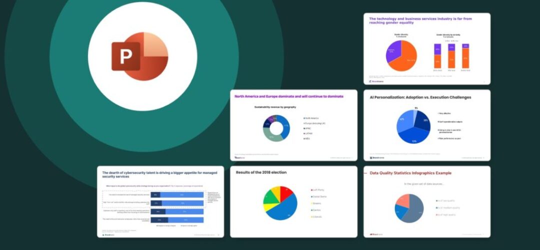
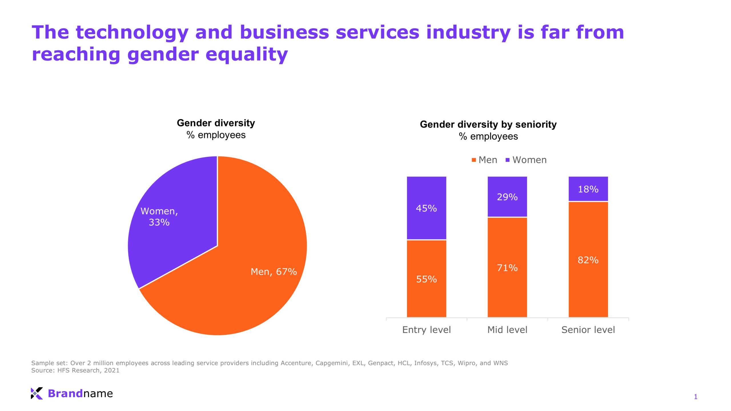
Before: A pie chart and stacked bars show the numbers, but the message is buried. You have to stop and decode what’s happening.
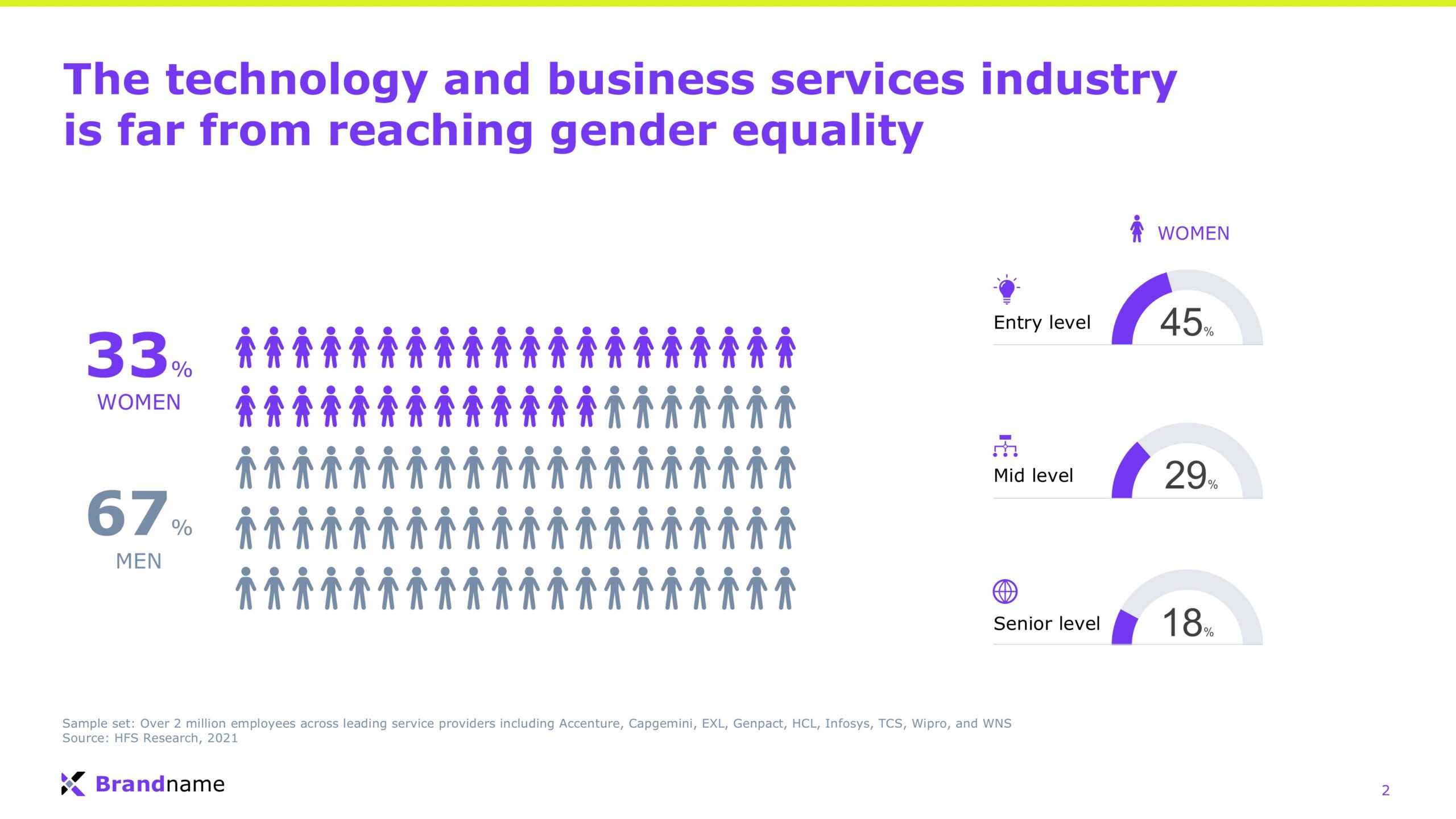
After: Rows of people and clean gauges make the imbalance impossible to miss, women drop from 45% at entry level to just 18% at senior level.
Why it works: The story is no longer hidden in charts, it’s visible at a glance.
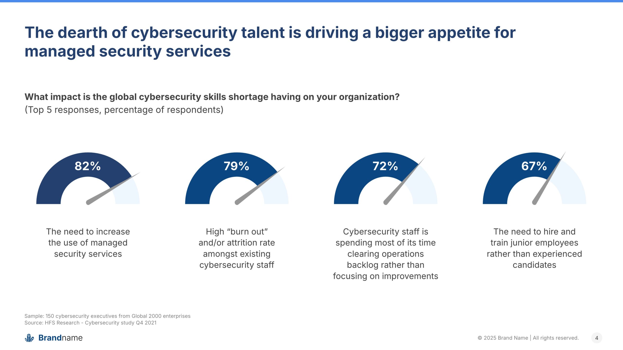
2. Cybersecurity impact: Bars vs Gauges
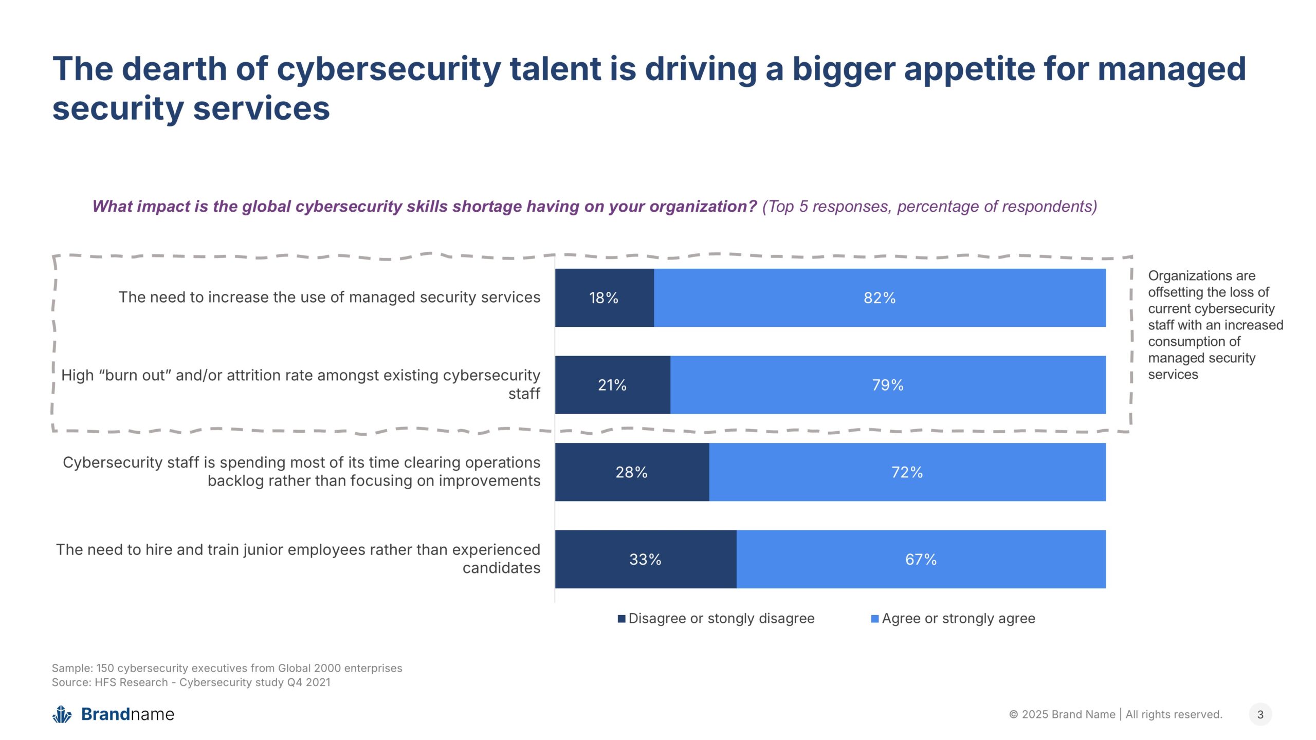
Before: The slide uses stacked bar charts to show agreement percentages. While accurate, the layout feels cluttered and forces the audience to read across text-heavy labels.
After: The redesign swaps bars for clean gauge visuals. Each response has its own dial, making it instantly clear which issues rank highest, from 82% citing the need for managed services to 67% pointing to junior hires.
Why it works: Instead of reading through blocks of text and percentages, the audience can scan and understand the story in seconds.
3. Geography: Donut vs Map
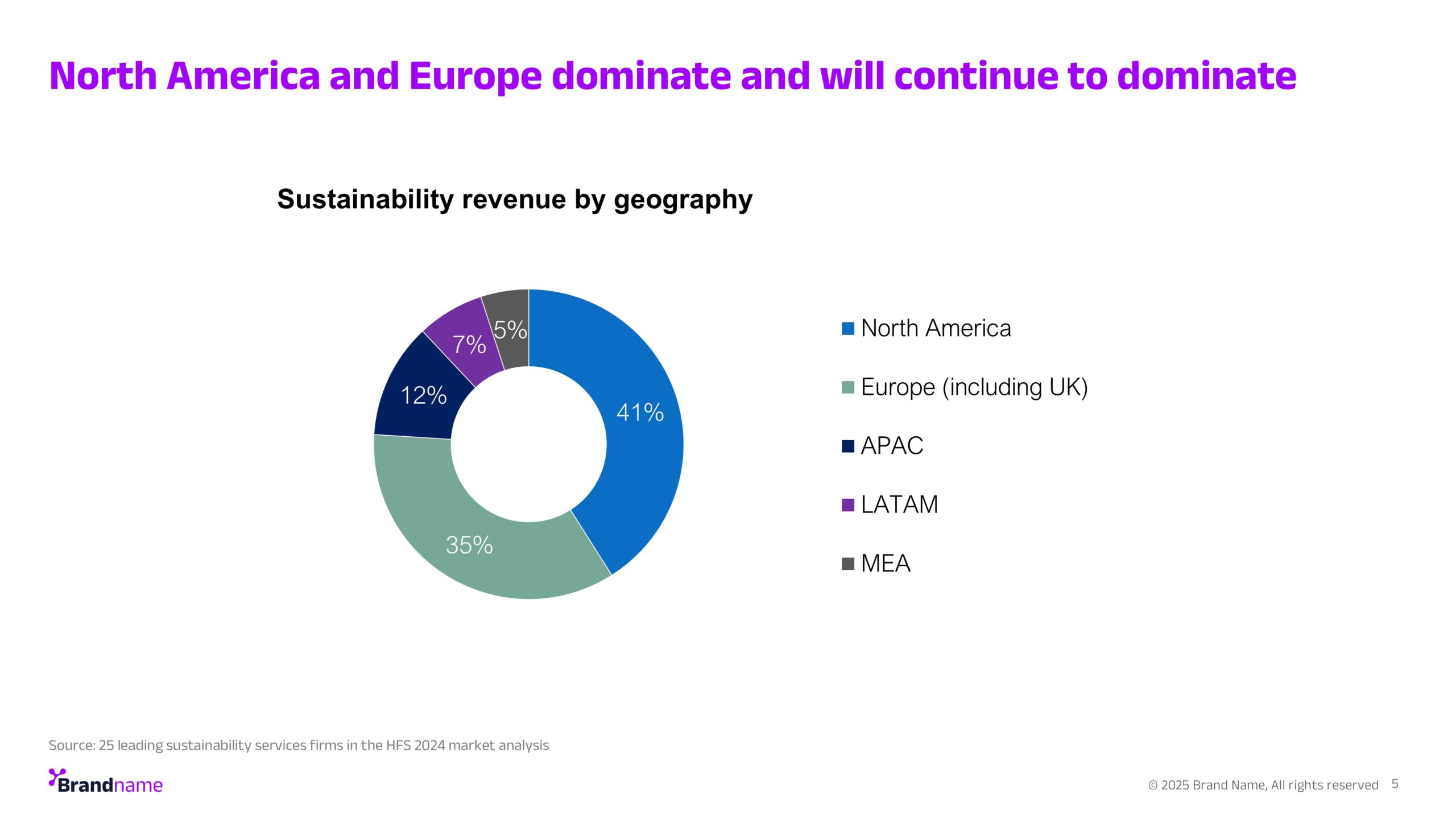
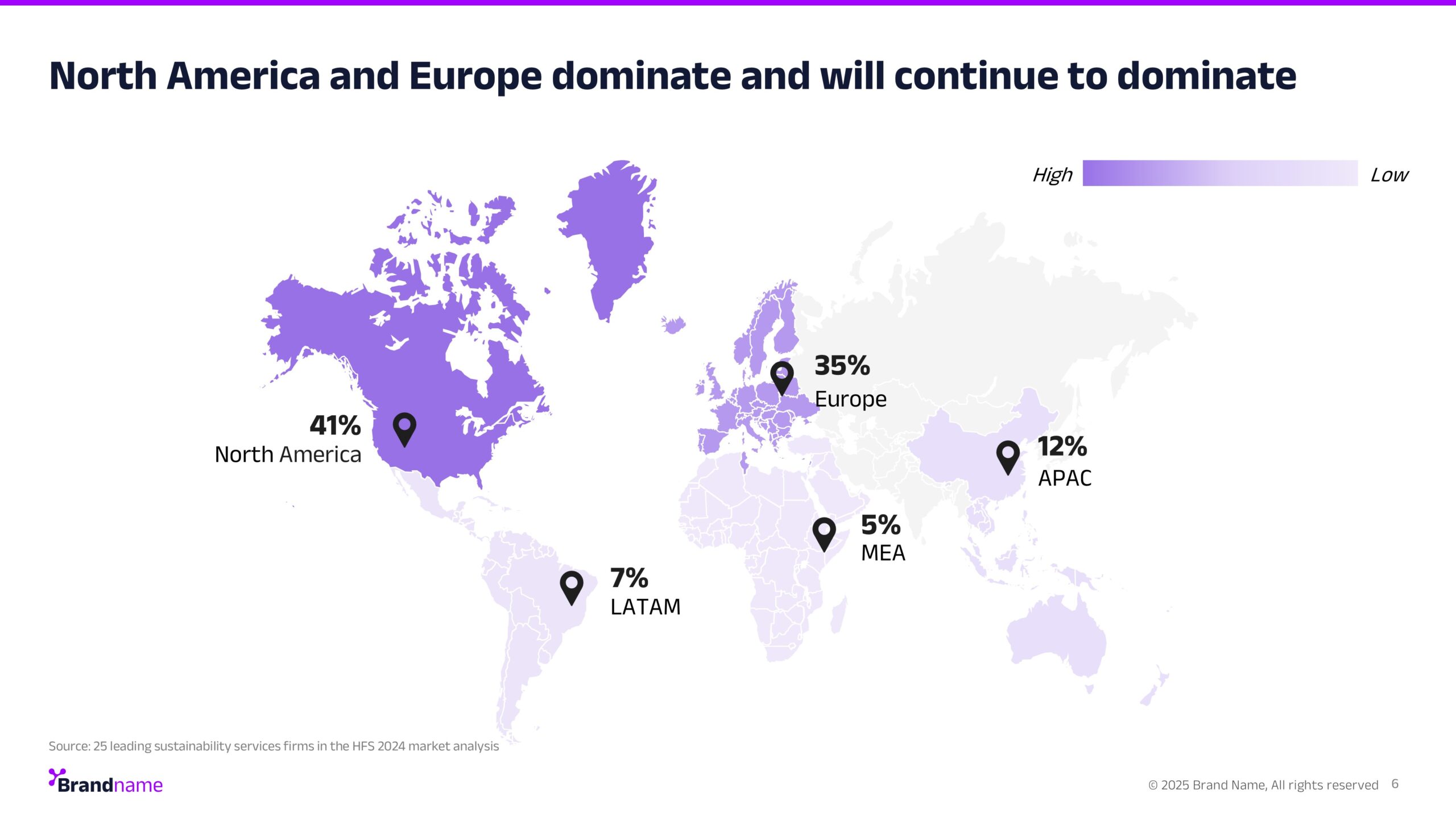
Before: A donut chart shows revenue by region. The data is accurate, but the story is abstract, you see percentages, not places.
After: A world map ties the numbers to geography. North America and Europe are shaded boldly (41% and 35%), while APAC, LATAM, and MEA appear smaller. The dominance is visible, not just listed.
Why it works: Instead of reading a chart and matching labels, the audience instantly sees where growth is happening, and where it isn’t.
4. Data quality: Pie vs Icons
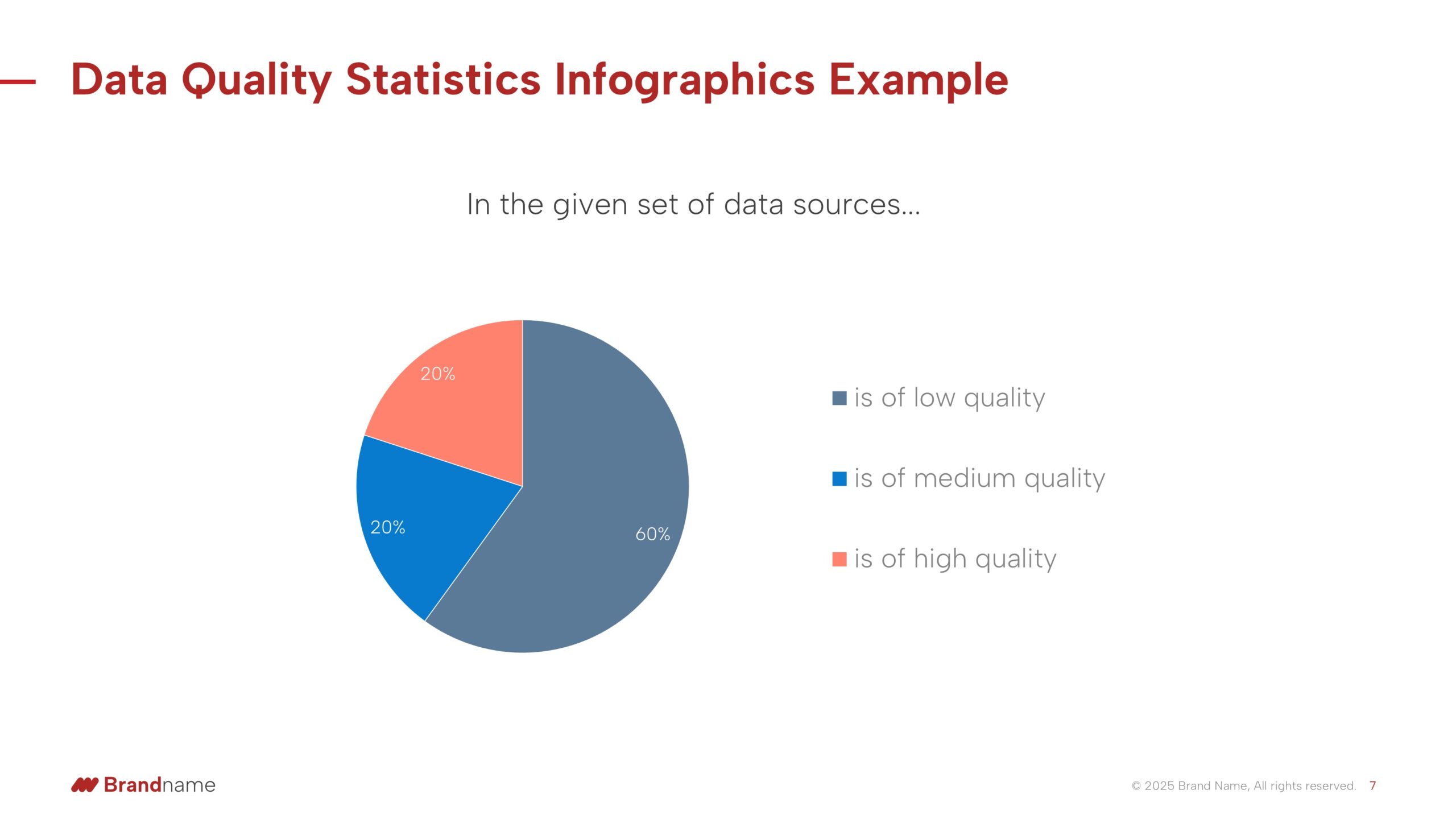
Before: A simple pie chart shows the share of low, medium, and high-quality data. The numbers are there, but the story feels generic and detached.
After: Rows of database icons break the data into something more tangible: 60% low quality, 20% medium, 20% high. Instead of abstract slices, you can see the imbalance.
Why it works: The redesign makes the problem harder to ignore, you don’t just know most data is low quality, you feel the weight of it.
5. GenAI impact: Pie vs People
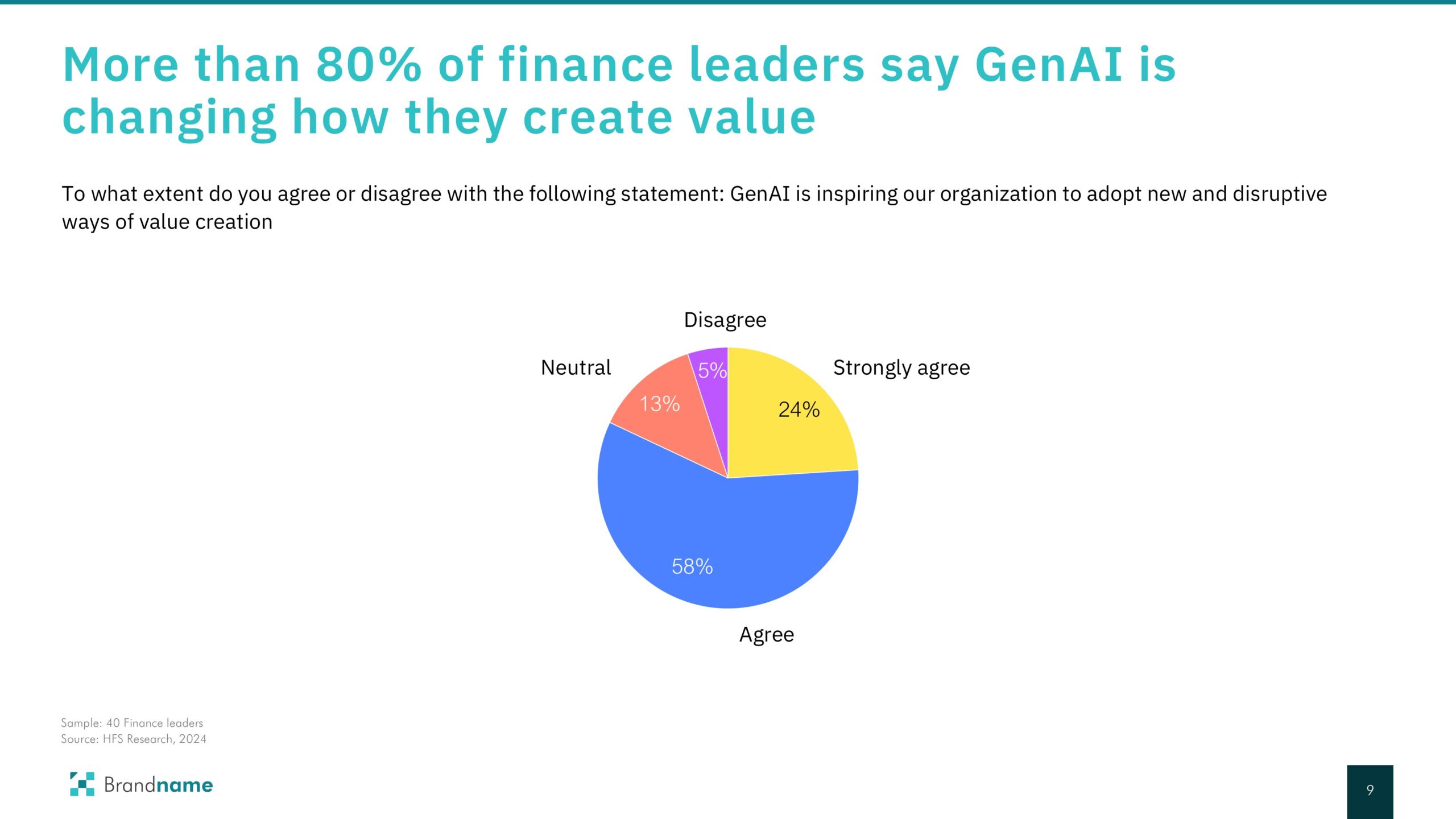
Before: A pie chart shows how finance leaders feel about GenAI. While it says more than 80% agree or strongly agree, the chart is just another circle of color-coded slices.
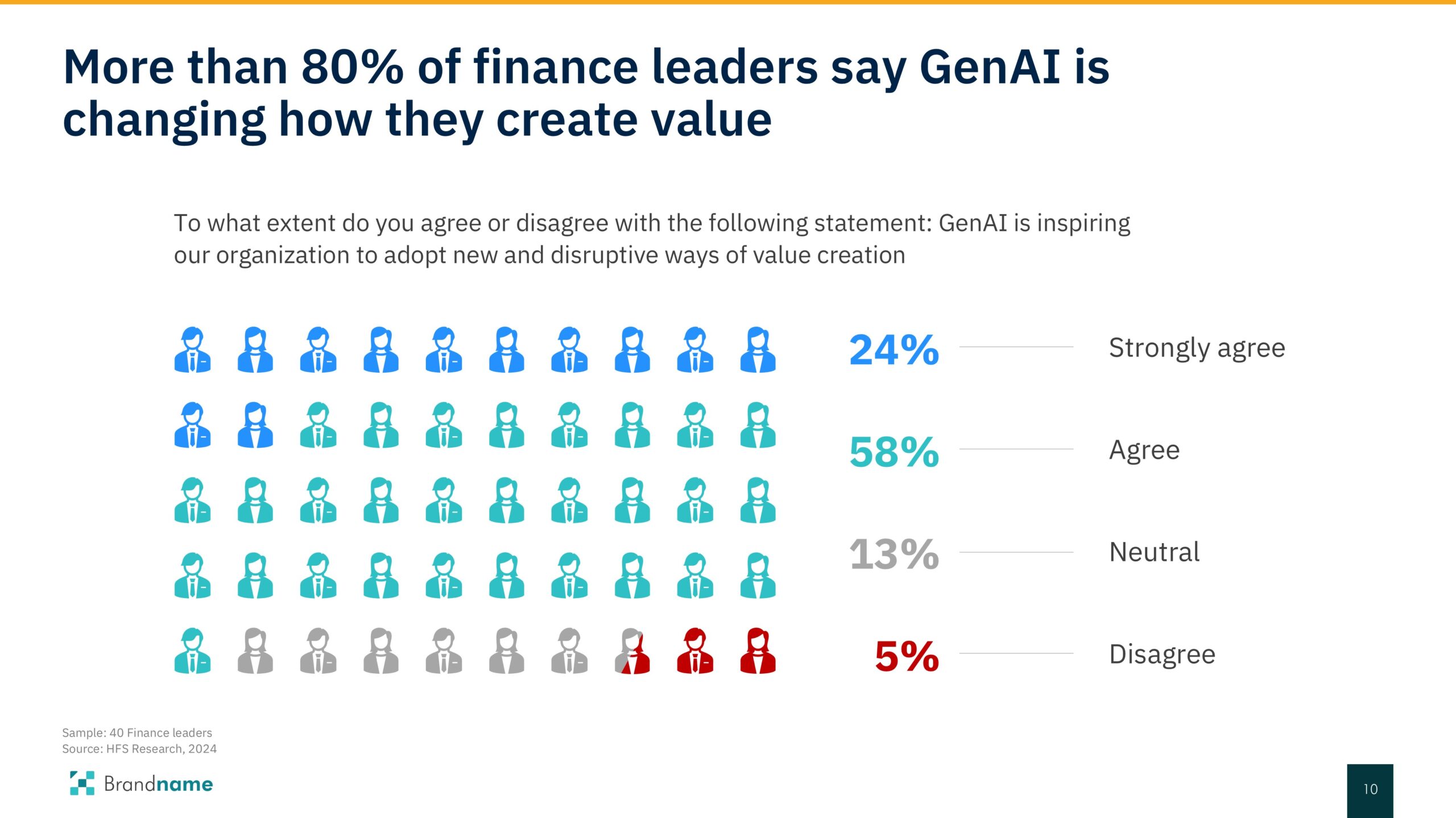
After: Rows of people icons make the sentiment human. You see 24% strongly agree, 58% agree, 13% neutral, and 5% disagree, each group clearly separated, each easy to compare.
Why it works: Instead of abstract percentages, the visualization turns the data into people, making the scale of support for GenAI impossible to miss.
6. Election results: Pie vs Seats
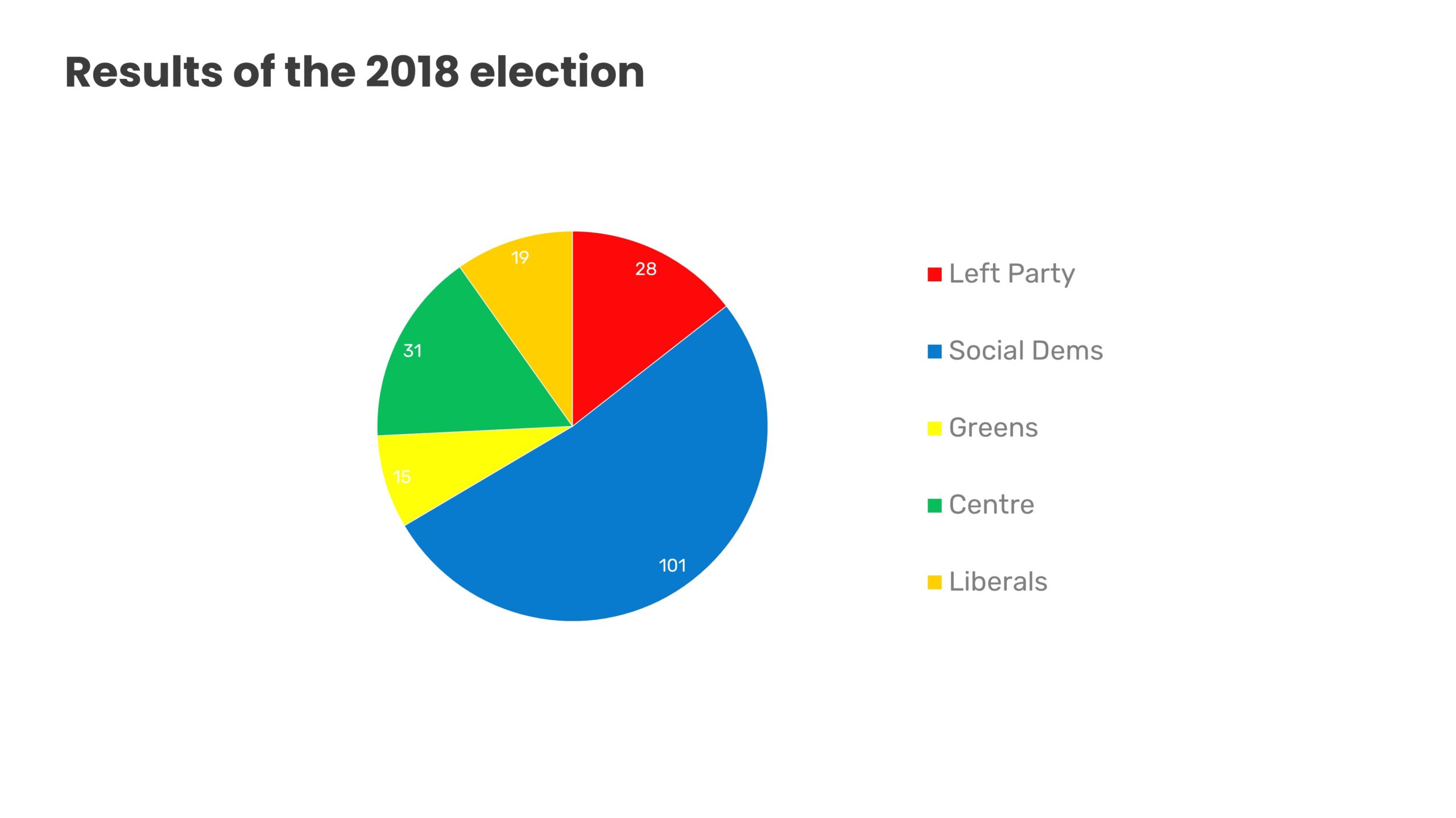
Before: A pie chart shows the share of votes by party. While it’s clear who has the most, it looks like any other circular breakdown.
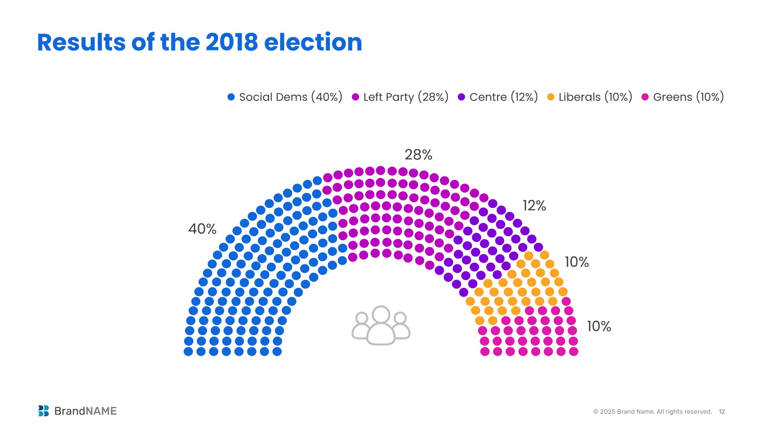
After: A semi-circle of dots represents actual seats, grouped by party. Social Dems at 40%, Left Party at 28%, Centre at 12%, Liberals and Greens at 10% each, all visualized like a real parliament.
Why it works: The redesign turns abstract percentages into a picture of power distribution, making the outcome easier to connect with the real-world impact.
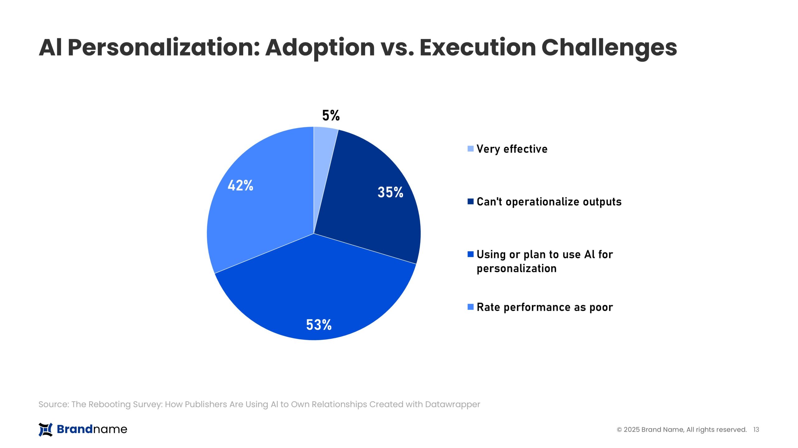
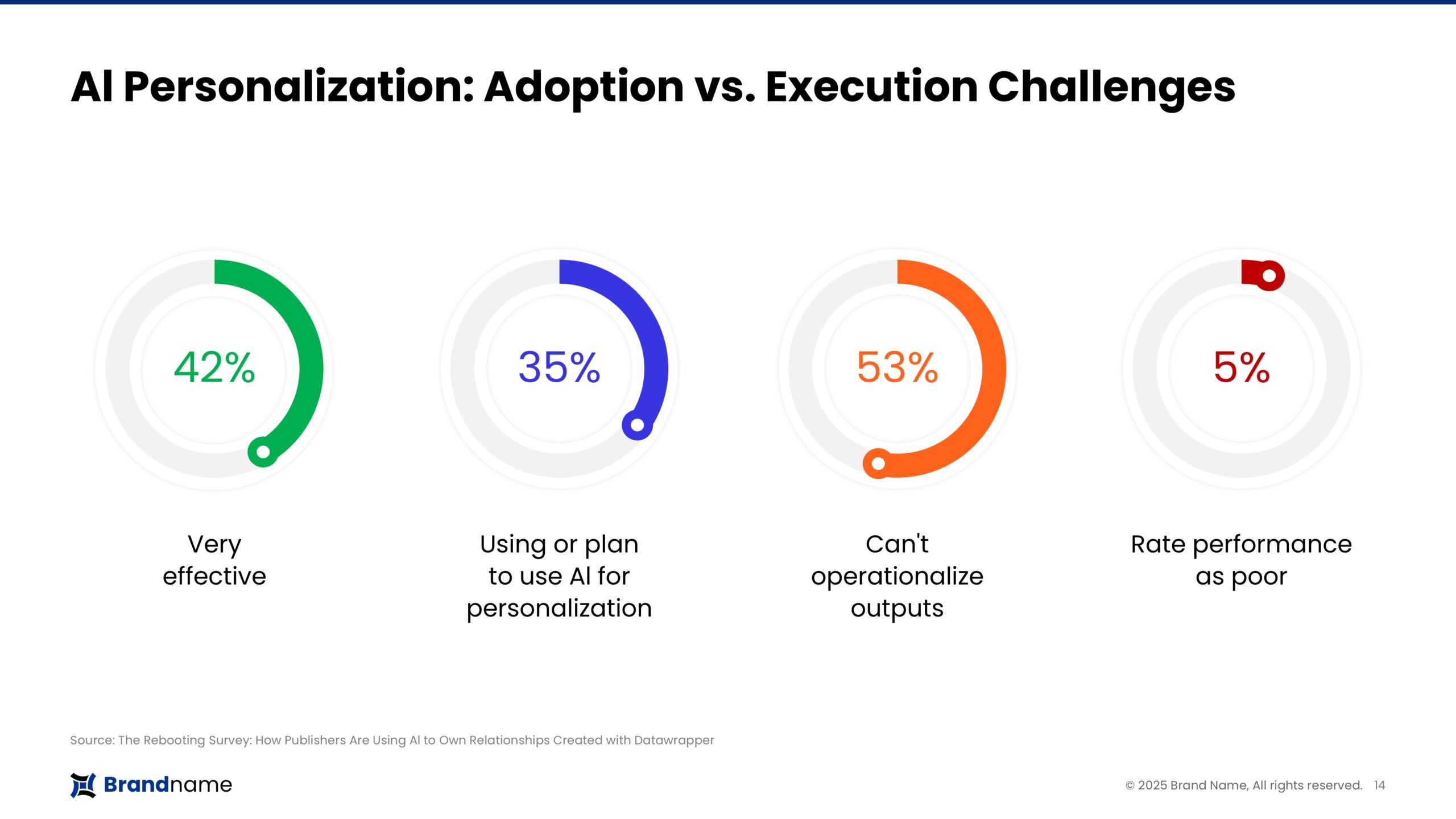
7. AI personalization: Pie vs Progress rings
Before: A pie chart shows adoption and challenges with AI personalization. While the numbers are there (42%, 35%, 53%, 5%), the chart is overloaded, and the categories blur together.
After: Each metric gets its own progress ring, paired directly with the label, very effective, using or plan to use, can’t operationalize, poor performance. Clean, simple, and instantly comparable.
Why it works: Instead of one busy pie, the audience gets four clear takeaways, each percentage stands on its own, and the comparisons are effortless.
The conclusion: PowerPoint is the currency of consulting, research, and strategy. But default visuals spend that currency poorly.
“In high-stakes conversations, the clarity of your slide is the clarity of your thinking.”
If every chart looks the same, your insight fades into the background noise. But when you reimagine PowerPoint visuals – highlighting, simplifying, and storytelling – you don’t just present data. You shape decisions.
So here’s the takeaway: don’t let your slides look like everyone else’s. Because in the rooms where it matters most, sameness is the quickest way to lose impact.
You may also like
We use storytelling and design to build high impact presentations for leading brands
PowerPoint design
services and outsourcing
Enterprises, analysts, consultants
Investor pitches
and fundraising narrative
Founders, fund managers
Sales presentations, proposals, and collaterals
Sales & marketing teams
PowerPoint template and visual slide bank
Enterprises, advisory & research firms
CXO presentations
and thought leadership
IT-BPO services & consulting firms
Financial, ESG,
and annual reports
Financial services, large enterprises
Training – PowerPoint design and visualization
Sales team, analysts, consultants
Conference and event presentations
Keynote speakers, event managers

