Redesigning the GMR Aero annual report: a Qcept design study
October 5, 2026 | 7 min read
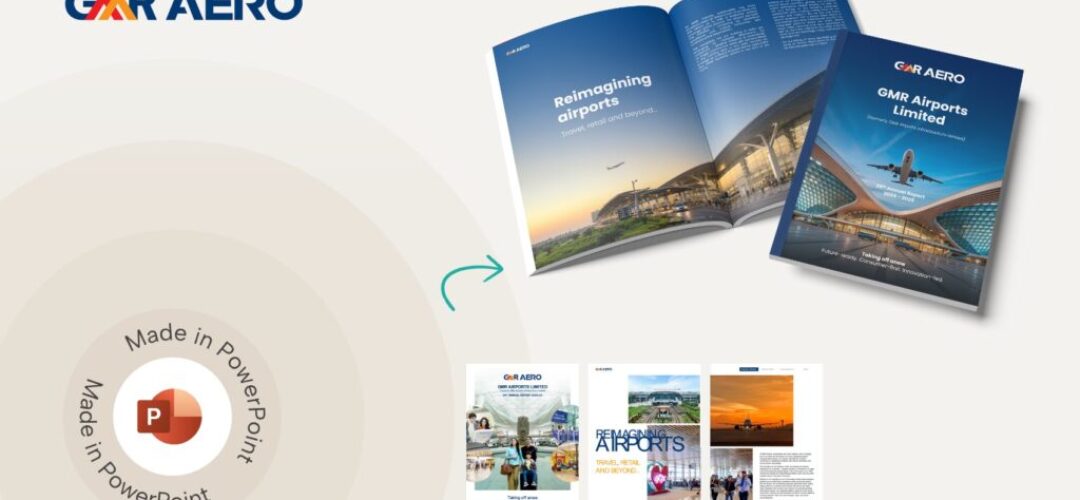
This annual report redesign is for marketing teams who need their annual report designed to read clearly and look like their brand, without rewriting the content or redoing the numbers.
Annual reports are hard to design. There is a lot of information to fit in, most of it numbers, and the company still wants the thing to look like it belongs to them and not to a template.
Archdeep, one of our visual designers, picked up the GMR Aero annual report, which is publicly available, and redid a few spreads to see what would change if the same content was laid out differently. GMR didn’t ask for this and wasn’t involved. It was a side exercise for us, mostly to test some ideas we keep talking about internally around reports.
She kept the content as is. Same text, same numbers, same tables. What changed was everything around it: colour, type, photography and how each page was put together.
The Situation
The report has everything it needs. The problem is that a lot of it is competing at once.
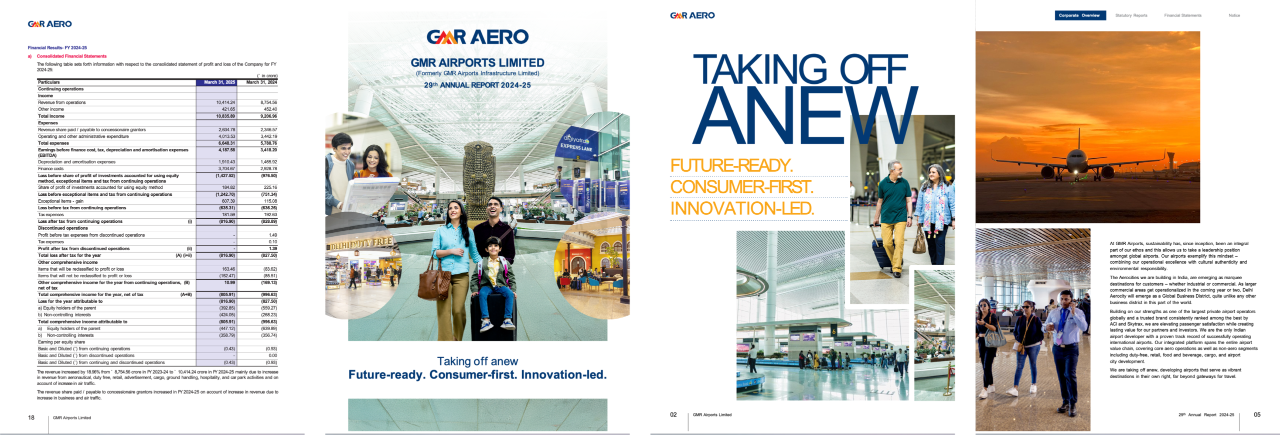
The cover is a good example. There’s the logo, three lines of title, a family in the middle, four circular photo cutouts around the edges and a tagline underneath. Each piece is fine, but together your eye doesn’t know where to land.
The opening pages lean on very large all caps headlines in blue, with orange taglines and dotted rules underneath, and photos stacked in a collage around them. On the “Reimagining Airports” page the headline actually runs into the photo, so the letters get hard to read. The narrative pages after that are white, with a photo on one side and a block of text on the other, and they start to feel the same after a while.
Then the financials. The full profit and loss statement sits on one page in small type, with the current year column highlighted in lavender. It’s all accurate, it’s just tiring to read. The financial highlights page puts a five column table above a large cafe photo that doesn’t really connect to the numbers.
The Approach
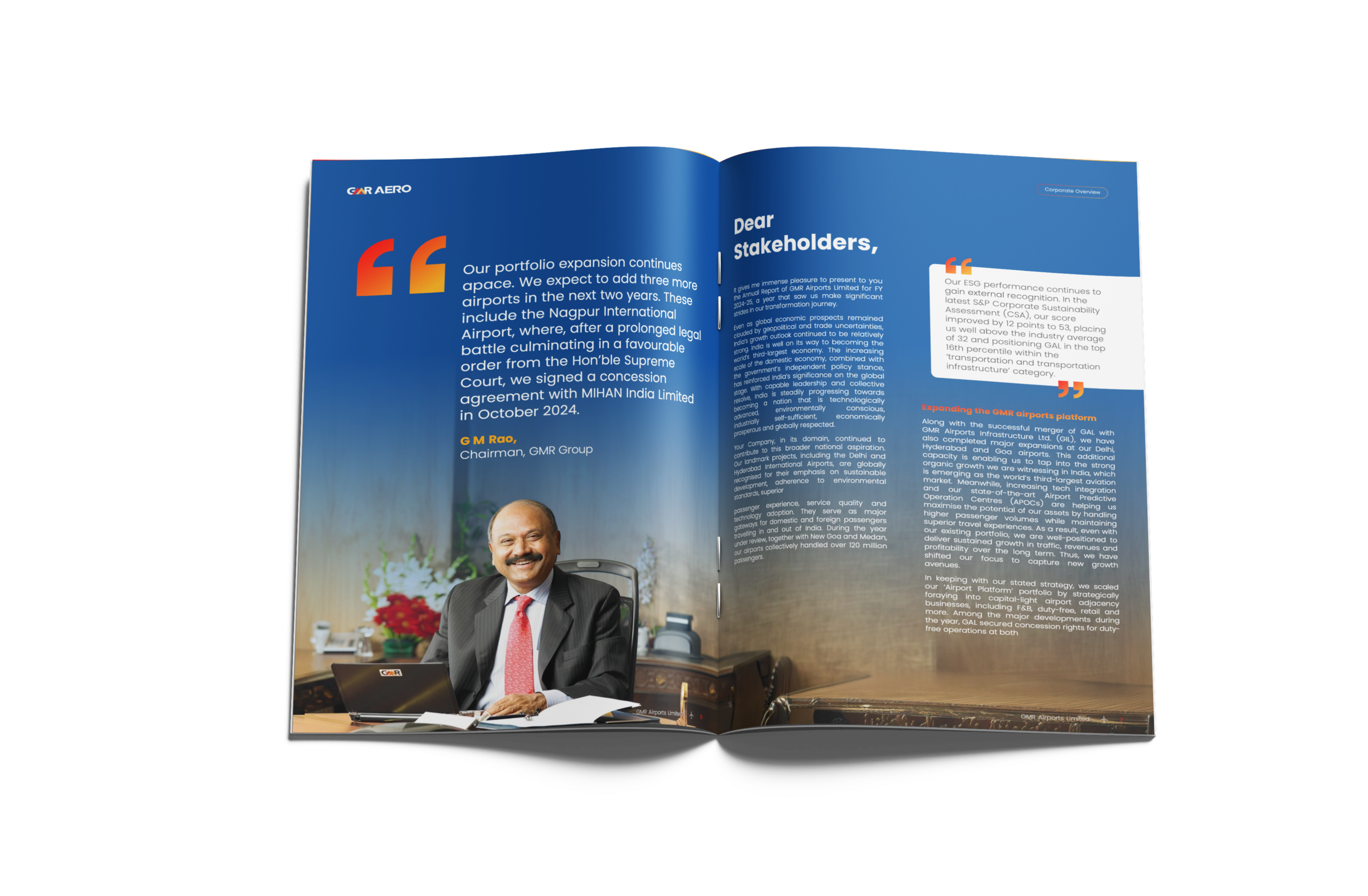
One colour world. The biggest shift is the deep blue gradient that now runs under the cover, the section openers, the Chairman’s message and the Board’s report. The blue comes straight from the GMR logo, so it still feels like their report, just more committed. The orange and red from the logo show up only as small accents: quote marks, section titles, the highlighted year in tables. Used that sparingly, they actually get noticed.
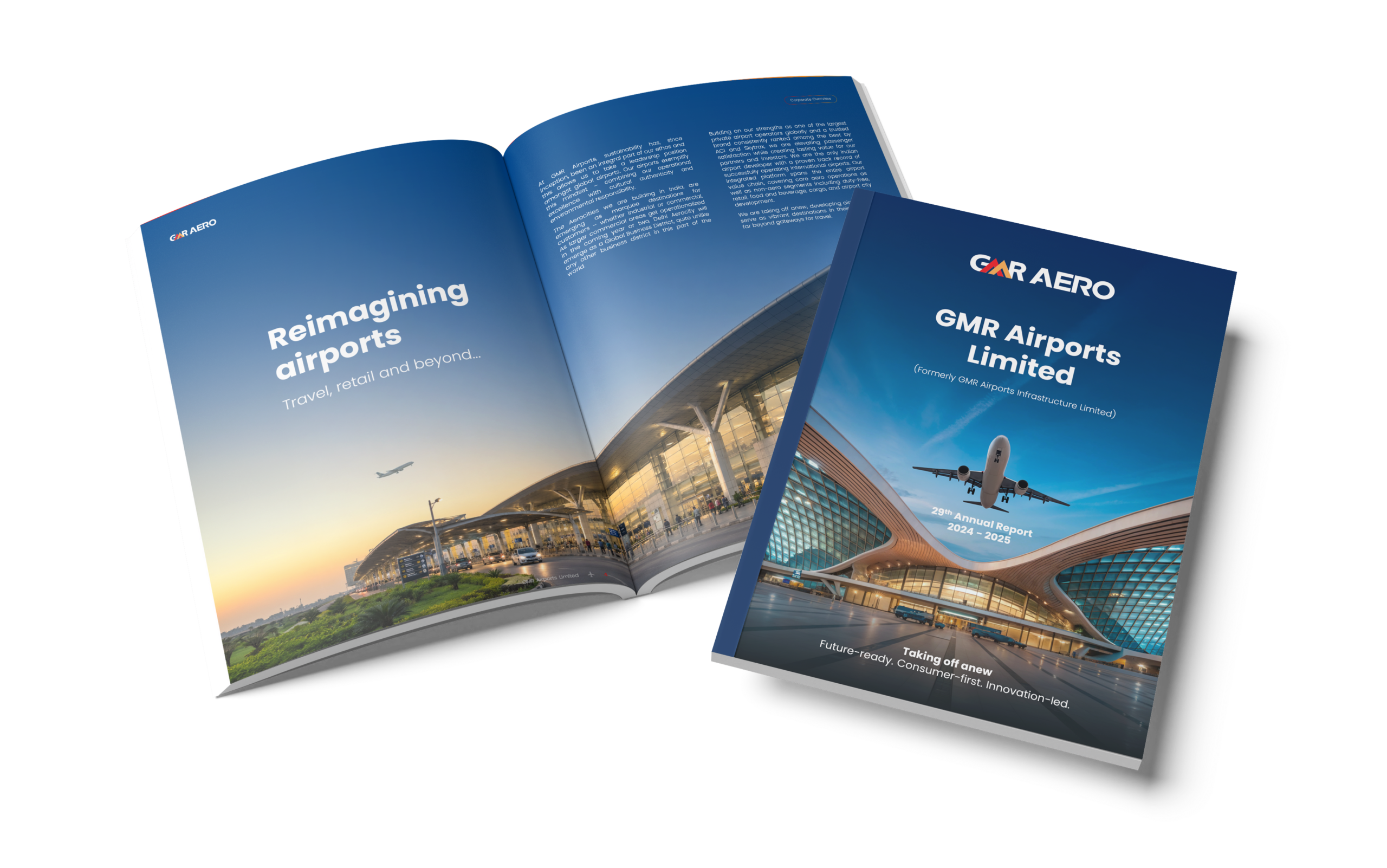
One photo, not five. Every opener now gets a single full bleed image instead of a collage. Mostly aircraft and terminal architecture. The cover is one plane lifting off over a terminal roof. “Taking off anew” is a plane on the tarmac with the text sitting in the sky above it. “Reimagining airports” is a terminal at dusk. Once there’s only one picture, it can be big enough to set the mood on its own.
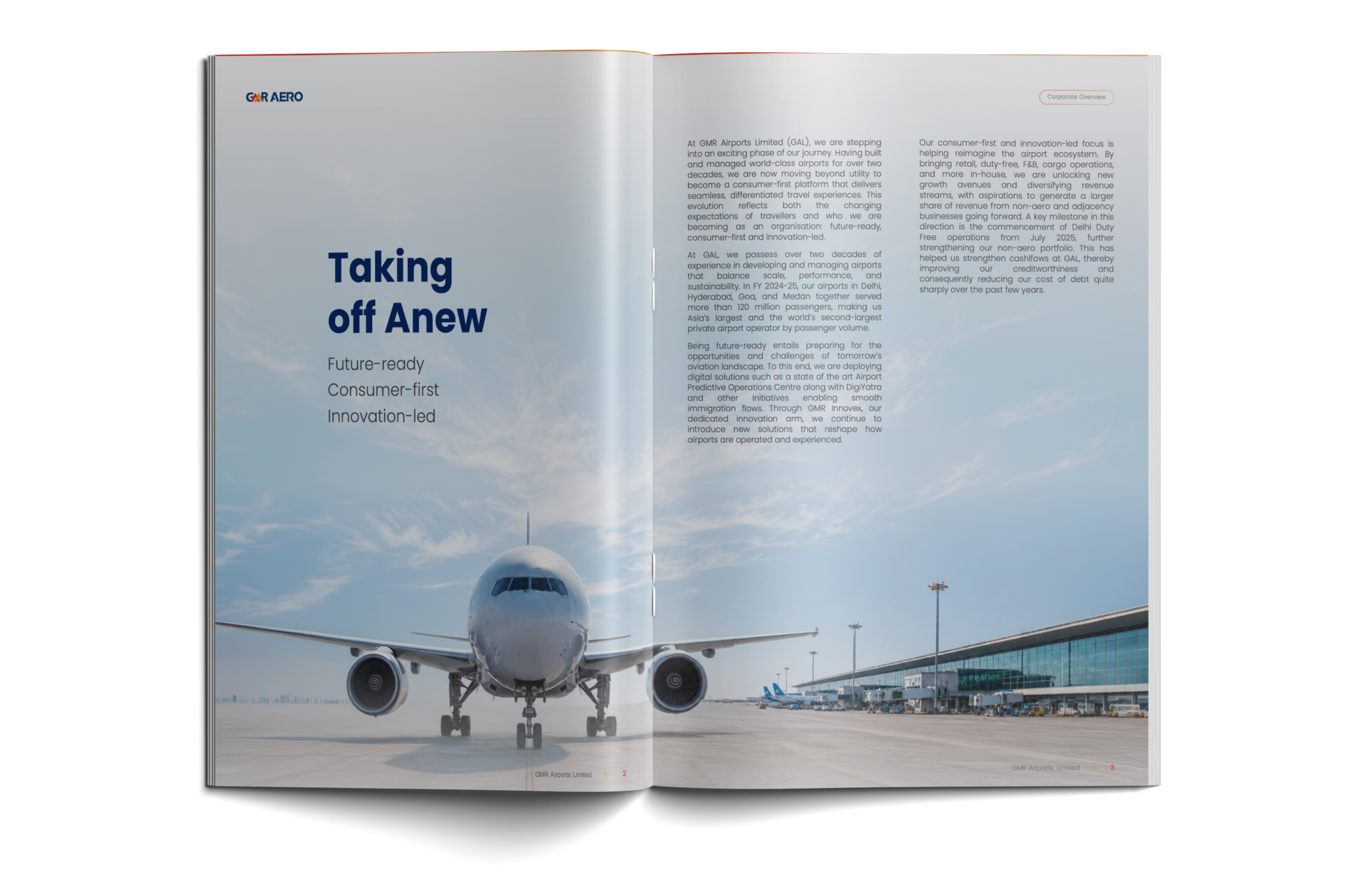
Quieter headlines. The all caps headlines became sentence case in a single rounded sans serif. “TAKING OFF ANEW” is now “Taking off Anew”, with the three taglines stacked underneath in a light weight. It’s less shouty, and it stops fighting with the photo.
The Chairman gets his words back. In the original his photo takes the top half of the page and the quote sits below. In the redesign the quote is the page, in large type with gradient quote marks, and his portrait sits at the bottom. The ESG quote from the letter is pulled into a white card on the opposite page so the one number worth remembering (CSA score up 12 points to 53) doesn’t get buried in body copy.
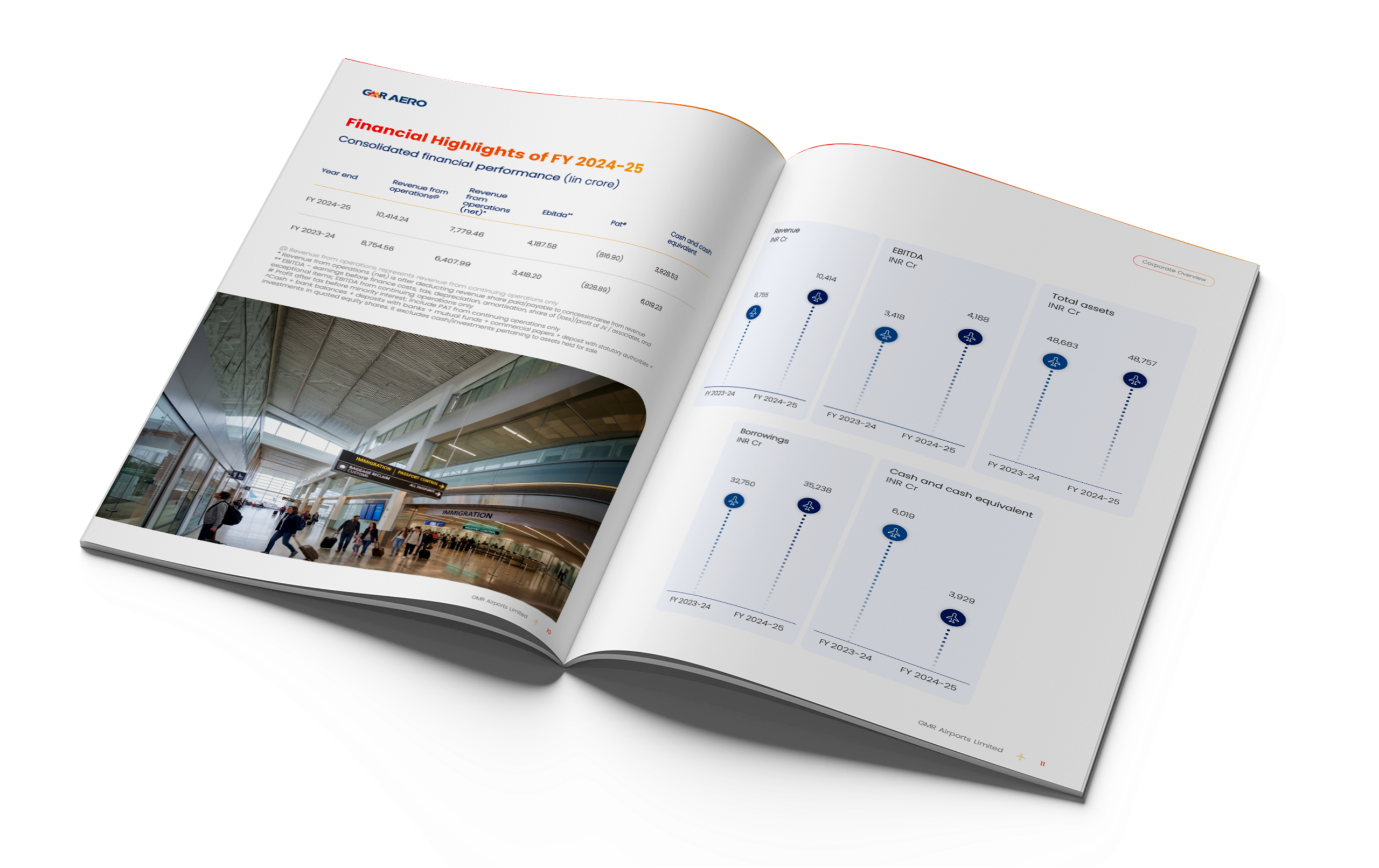
Charts you can read in a second. The five financial highlight charts (revenue, EBITDA, total assets, borrowings, cash) were redrawn as dotted stems with a small aircraft marker at the top of each. It’s a bit of fun, but it also works: the drop in cash from 6,019 crore to 3,929 crore literally reads as a plane coming down. The full P&L table stayed intact, with the current year column in a warm amber, lighter rules and bold totals so the eye goes to the right rows first.
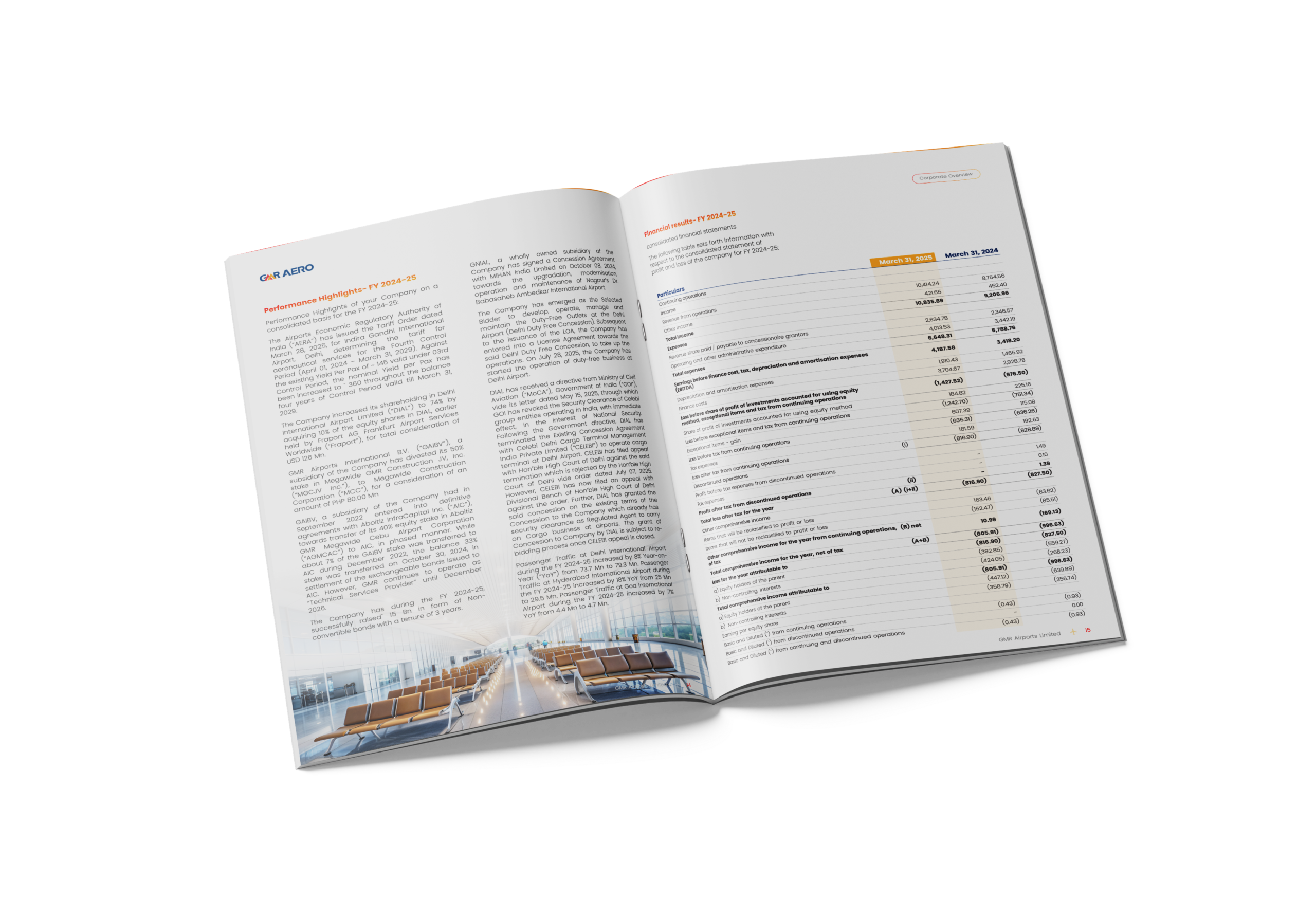

An annual report has two readers: the one who skims and the one who checks every number. The design had to work for both. A single dominant image and headline per spread for the skimmer, a disciplined colour system so the eye knows where the important figure is, and tables left exactly as they are for the person who reads every line.

Archdeep Kaur
What we didn’t touch, and what we’d test
Not a single word or number changed. That was the rule from the start, because the point was to see what design alone could do. If we had rewritten the copy too, it would be hard to say which change was actually helping.
The logo and its colours stayed as well. We just pushed the blue much further than the original does.
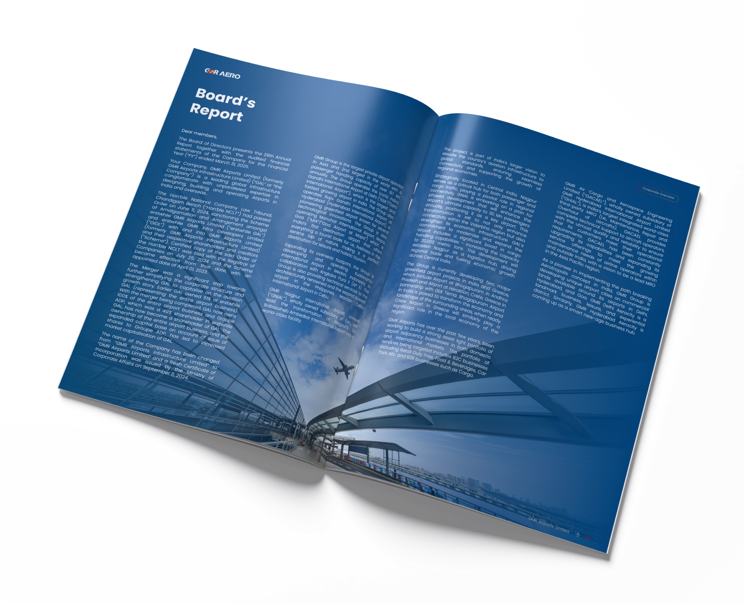
And this is a handful of spreads, not a full report. A real annual report runs past a hundred pages, with statutory and financial sections that leave very little room to play. Those are the hard pages, and we didn’t do them here.
The conclusion: Why we do these
Most of our client work can’t be shown publicly, so exercises like this are how we try things out in the open. If you’re working on a report and the content is fine but people still aren’t reading it, the layout is usually where to look first.
This is an independent concept by Qcept based on the publicly available GMR Aero (GMR Airports Limited) annual report. It is not commissioned by or affiliated with GMR Airports Limited. All trademarks and brand assets belong to their owners.
Questions we hear often
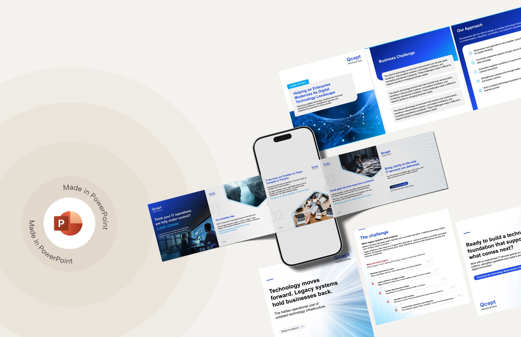
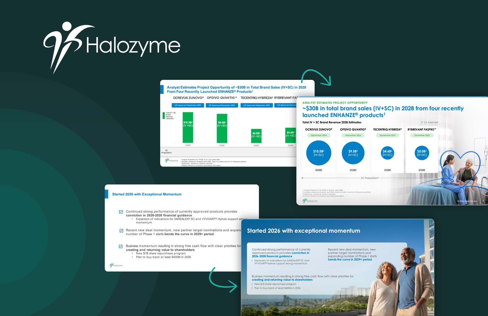

We use storytelling and design to build high impact presentations for leading brands
PowerPoint design
services and outsourcing
Enterprises, analysts, consultants
Investor pitches
and fundraising narrative
Founders, fund managers
Sales presentations, proposals, and collaterals
Sales & marketing teams
PowerPoint template and visual slide bank
Enterprises, advisory & research firms
CXO presentations
and thought leadership
IT-BPO services & consulting firms
Financial, ESG,
and annual reports
Financial services, large enterprises
Training – PowerPoint design and visualization
Sales team, analysts, consultants
Conference and event presentations
Keynote speakers, event managers