3 Free LinkedIn carousel templates for IT Services Marketers (Editable in PowerPoint)
August 26, 2026 | 6 min read
This post is for marketers at IT consulting and IT services firms who want carousels that look designed instead of thrown together in Canva, without spending hours on layout every time.
If you run marketing for an IT consulting or IT services firm, you already know LinkedIn carousels work. They get more dwell time, more saves, more shares than a static post or a link drop. The problem is not knowing that. The problem is having three or four hours to design one every time you want to post something that looks like it belongs on the feed of a firm people would actually hire.
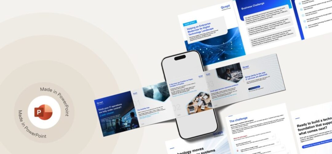
So here are three carousel templates we built and use ourselves, fully editable in PowerPoint. Swap the copy, the stats, the images, and they are yours. No design software, no learning curve, no watermark to fight with.
Below each one is what it is actually built for, so you are not guessing which template fits which post.
Note: the photography shown in these template previews is licensed stock, used here for demonstration only. It is not cleared for you to lift and reuse in your own posts. Swap it out with your own imagery or a stock source you are licensed to use before you publish.
1. The thought-leadership carousel
Use this when: you want to put a point of view in front of prospects before you are trying to sell them anything.
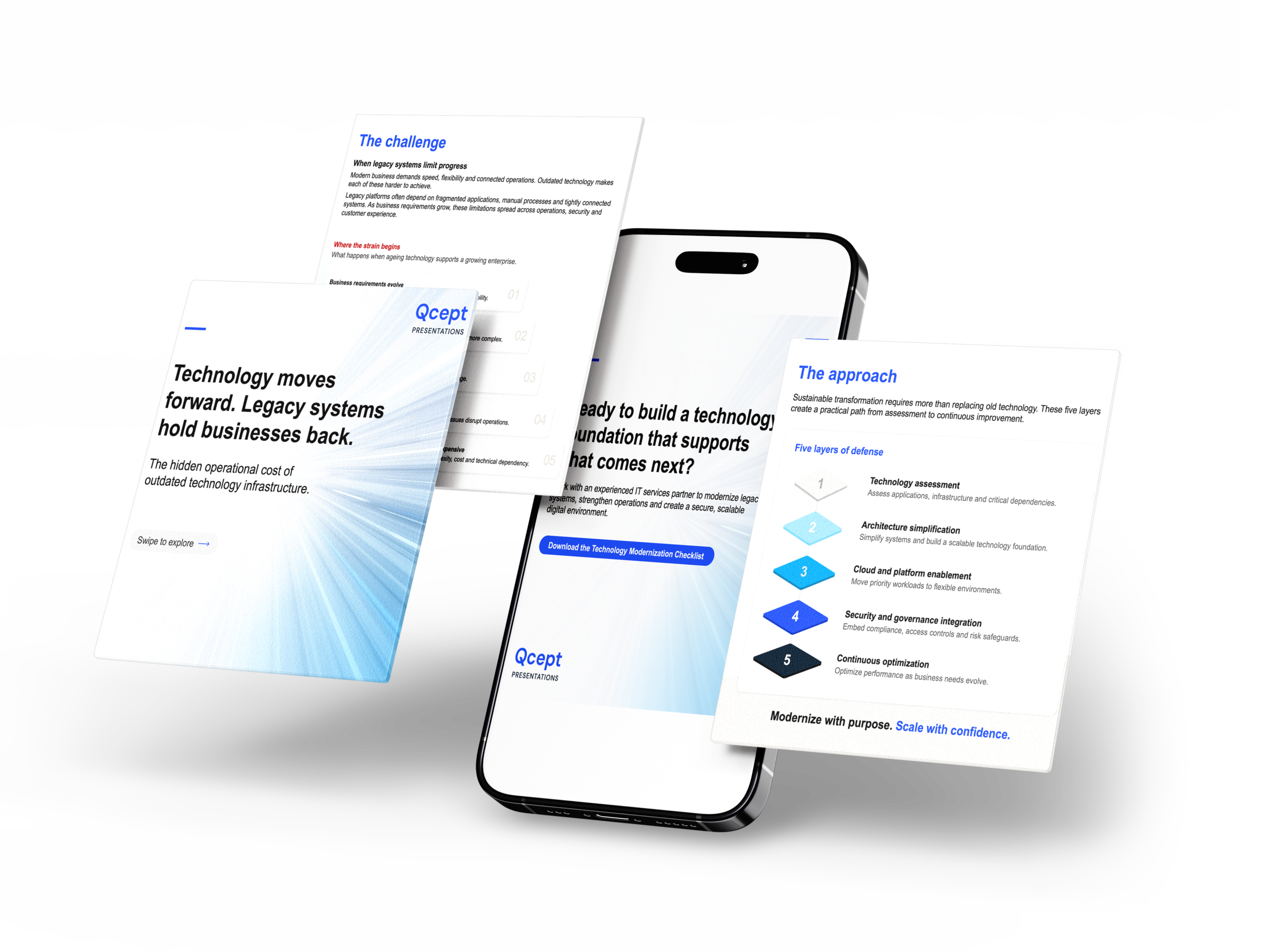
This one opens with a claim most of your audience will nod along to (legacy systems slow enterprises down), moves into where the pain actually shows up operationally, then lands on a five-step framework that positions your firm as the one who has already mapped the path out. The last slide has a soft download CTA, not a sales pitch.
This is the template to reach for when you want a post that builds credibility on a topic your firm actually has a strong opinion on. It works because the structure does not ask the reader to trust you yet. It asks them to agree with you first.
2. The problem-narrative carousel
Use this when: the reader has not fully named the problem you solve, and your job is to make them recognize it.
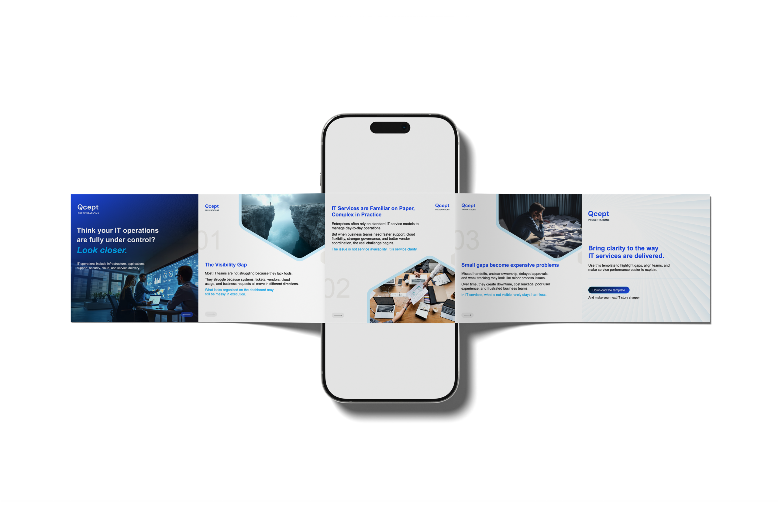
This template is built around a slower reveal. It opens with a question that creates a little doubt (“think your operations are fully under control? Look closer”), then walks through three numbered stages, each with its own visual and a short, sharp line under it. The gap between what looks organized and what is actually happening in execution is the whole engine of this one.
Use this for consideration-stage content, when you are not trying to prove expertise as much as trying to get someone to sit with a problem they have been quietly living with. It is the hardest of the three to write well because the copy has to imply more than it states. But when it lands, it is the one that gets saved and sent to a colleague.
3. The case-study carousel
Use this when: you have a result and you want the numbers to do the talking.
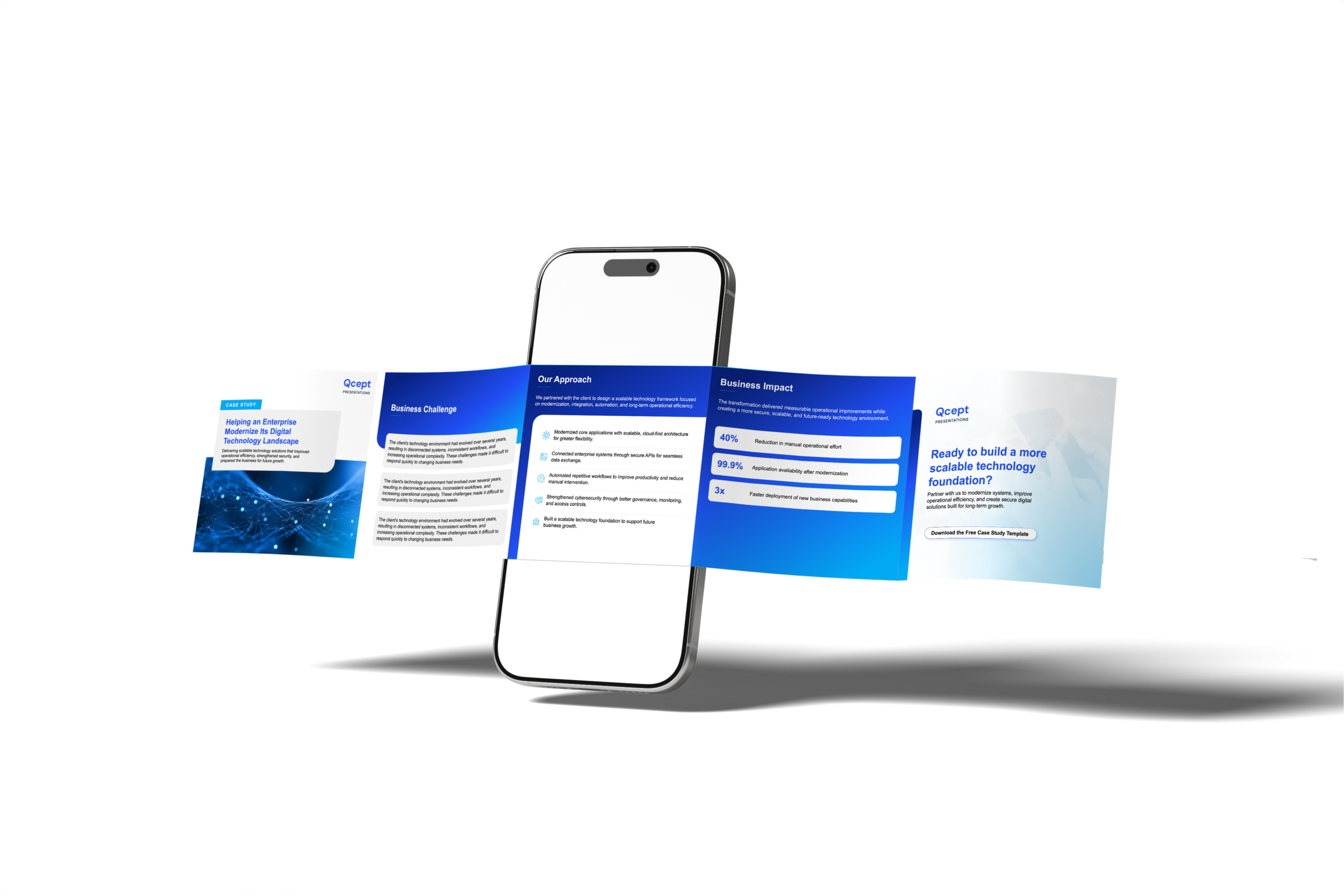
Challenge, approach, business impact, close. This is the most straightforward structure of the three, and that is the point. By the time a prospect is reading a case study, they do not need to be convinced something is a problem. They need proof someone else’s problem got solved. The three stat callouts in the middle (in our version: 40 percent reduction in manual effort, 99.9 percent application availability, 3x faster deployment) are what earns attention on a case-study carousel. Adjectives do not.
This is your bottom-of-funnel post. Use it after a project wraps, when you have real numbers, even directional ones, to put in those boxes.
How to actually make these yours
Swapping in your logo and colors is the easy part. What makes these worth using is understanding why each one is built the way it is, so you can keep the structure and change everything else.
A few things worth doing before you post:
- Replace the imagery with something that actually reflects your industry vertical, not generic stock photography that could belong to anyone
- Keep the slide count and pacing. These are built to work as a swipe, not a printed page
- If you do not have hard numbers for the case-study template yet, do not force fake precision. A directional range is more credible than an invented decimal point
If you need one built around you
These templates are free because the structure is the reusable part. The brand is not.
If you have a story that does not fit neatly into one of these three shapes, or you want a carousel concept built specifically around your firm’s positioning, your actual data, and a voice that sounds like you instead of a template, that is custom work. That is what we do at Qcept Presentations for consulting and IT services firms. If that is where you are, reach out and we will build it with you instead of handing you another template to edit alone.
The conclusion: Three templates, three stages of the funnel.
Thought leadership to open a conversation, a problem narrative to make someone recognize a pain they have been living with, a case study to close the loop with proof. Pick the one that matches what you are actually trying to do with the post, not the one that looks the easiest to fill in.
Download all three, edit them with your own voice and numbers, and put them on the calendar. That is the whole point of a template. It should save you the four hours of layout work, not do your thinking for you.
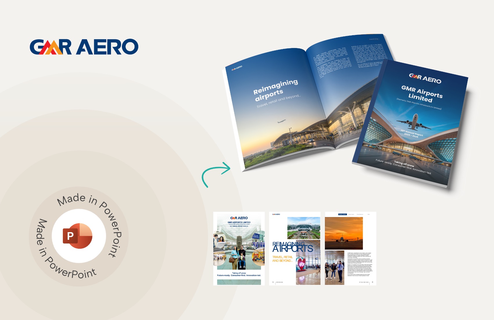
We use storytelling and design to build high impact presentations for leading brands
PowerPoint design
services and outsourcing
Enterprises, analysts, consultants
Investor pitches
and fundraising narrative
Founders, fund managers
Sales presentations, proposals, and collaterals
Sales & marketing teams
PowerPoint template and visual slide bank
Enterprises, advisory & research firms
CXO presentations
and thought leadership
IT-BPO services & consulting firms
Financial, ESG,
and annual reports
Financial services, large enterprises
Training – PowerPoint design and visualization
Sales team, analysts, consultants
Conference and event presentations
Keynote speakers, event managers