Seven ways how you can convert plain bullets into engaging slides
January 17, 2025 | 5 min read
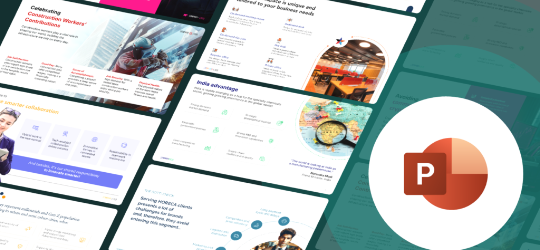
If your slides are basically a wall of bullets dressed up with a logo, this post walks through seven before and after redesigns and what changed in each one, from plain text blocks to slides that actually do something.
Alright, let’s talk about the villain of PowerPoint presentations. No, not the printer that jams at the worst time or the coworker who “replies all” to everything. I’m talking about the universal symbol of “I had no idea what else to do with this slide.” The bullet point.
Bullet points are like the beige walls of presentations. They exist, but do they inspire? Not really. They just sit there, lifeless, saying, “Hey, I’m technically doing my job, but don’t expect much more.” And yet, we keep relying on them, every meeting, every deck, like that one friend who always shows up with store-bought coleslaw at a potluck.
But here’s the thing: it’s not just the bullet points. We overuse them, stack them up endlessly, and before long, our slides start looking more like a cluttered list than an engaging visual. By the eighth bullet, your audience is already daydreaming about lunch.
And sub-bullets? Let’s not go there. They’re the bullet point’s awkward younger sibling, unnecessary and unhelpful. Add a sub-sub-bullet, and suddenly your slide feels more like a maze than a message.
It’s time to fix this. Let’s break down these presentation crimes and explore seven ways to turn lifeless bullets into slides that truly engage your audience.
1. Plain Text vs. Visual Clarity
The “wall of text” slide, every presenter’s worst offense. It’s not a slide; it’s a novel. By the time your audience finishes reading it, they’ve lost interest (and possibly track of time). Worse? Reading it aloud during your presentation screams, “I didn’t prepare.”
Now, picture this: trim the text, add icons, and space it out. Suddenly, your slide transforms from a chore to a delight, like upgrading from a cramped cubicle to a room with a view.


2. Highlighting what matters
Bullet points treat every idea equally, but in presentations, that’s chaos. If everything is important, nothing stands out. It’s like trying to yell over yourself.
The solution? Give your key points the VIP treatment, bold visuals, smart contrasts, and clear hierarchy. Now your message doesn’t just get noticed; it commands attention.


3. Adding personality
Bullet points have all the charm of a DMV employee. Now, imagine introducing Rohan and Ruhi, characters we created for a slide, complete with custom illustrations and relatable quirks. Suddenly, your audience isn’t just reading; they’re engaging. It’s like your slides got a personality makeover.


4. Storytelling with Design
Lists that go nowhere are the bad plot twists of presentations: “Here’s a problem, another problem, and… the end.”
Instead, we transform that list into a visual journey. Take the HORECA Bottleneck slide, for example challenges arranged in a circular flow, connected with smart visuals. Suddenly, your slide isn’t just a list. It’s a story with a clear beginning, middle, and end.


5. Celebrating emotion and impact
Dry stats and facts, classic bullet point territory. They’re like plain toast: functional but uninspiring.
Now, imagine a slide about construction workers infused with pride and emotion. Suddenly, it’s not just data; it’s about people. The audience doesn’t just process the information, they feel it.


6. Engaging the Skeptic
Bullet points are great at listing reasons. But influencing someone? Not so much.
Instead, we transformed a slide with modern design, relatable visuals, and a clear message: “Here’s why this matters to you.” It’s no longer just a list, it’s a pitch. And the result? The audience is sold.


7. Showcasing Strengths
Stats hidden in bullet points are like needles in a haystack, hard to find and easy to overlook.
We take those stats and roll out the red carpet with bold icons, striking visuals, and standout layouts. The result? Data that’s not just seen but remembered.


The conclusion: Death by bullets is real, and now you know how to dodge that bullet.
A boring deck says, “I didn’t have time.” A sharp one says, “This matters.”
A boring deck says, “Here’s the bare minimum.” A sharp one says, “Here’s everything you need to connect and act.”
A boring deck says, “Just get through it.” A sharp one says, “This is worth your attention.”
So, let’s stop the madness. No more slides that make your audience’s eyes glaze over. No more pretending bullet points are the best we can do. It’s time for better stories, better visuals, and better presentations.


We use storytelling and design to build high impact presentations for leading brands
PowerPoint design
services and outsourcing
Enterprises, analysts, consultants
Investor pitches
and fundraising narrative
Founders, fund managers
Sales presentations, proposals, and collaterals
Sales & marketing teams
PowerPoint template and visual slide bank
Enterprises, advisory & research firms
CXO presentations
and thought leadership
IT-BPO services & consulting firms
Financial, ESG,
and annual reports
Financial services, large enterprises
Training – PowerPoint design and visualization
Sales team, analysts, consultants
Conference and event presentations
Keynote speakers, event managers


